Avenues Minimal - Kitchen & Courtyard Reveal
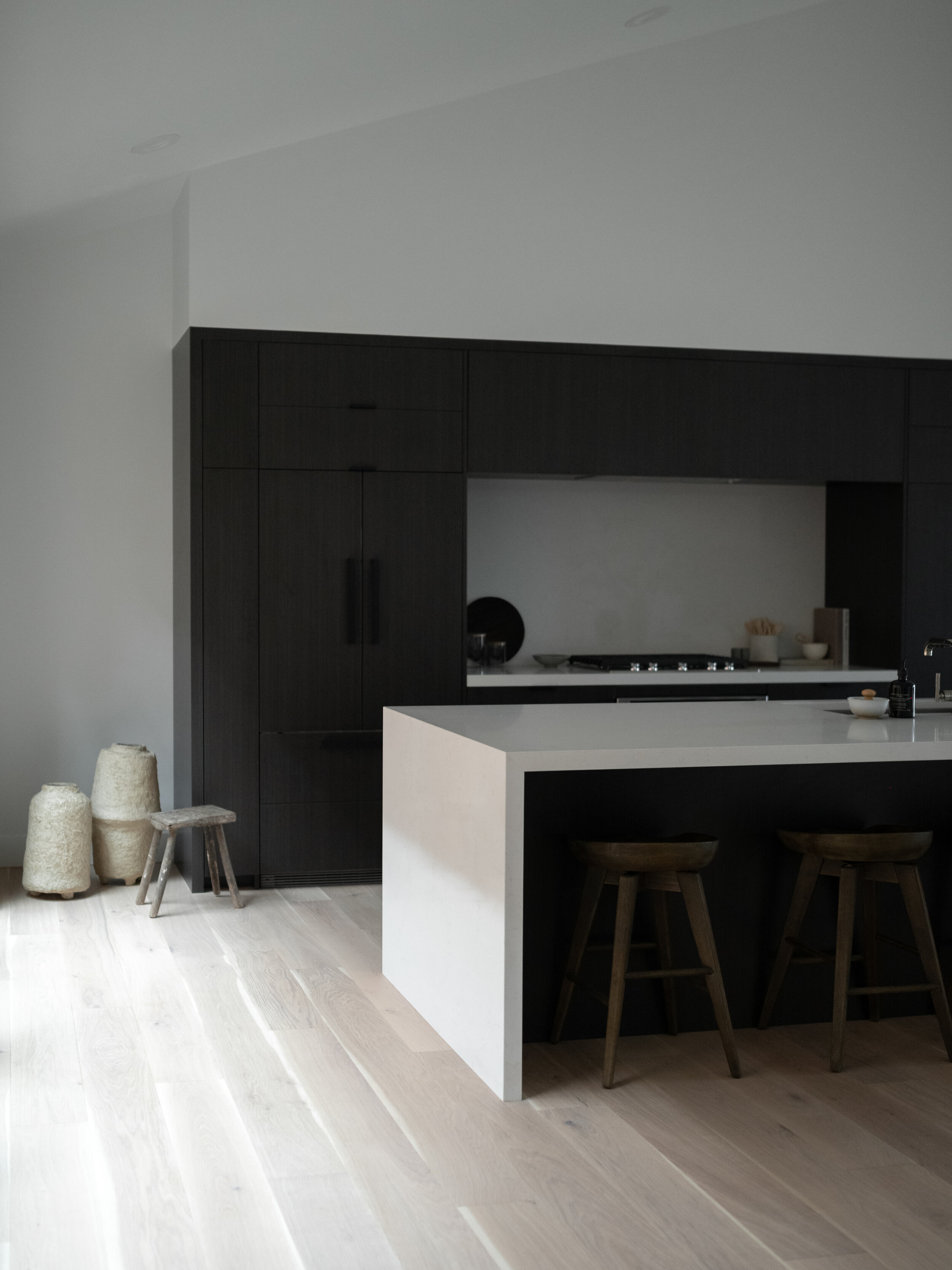
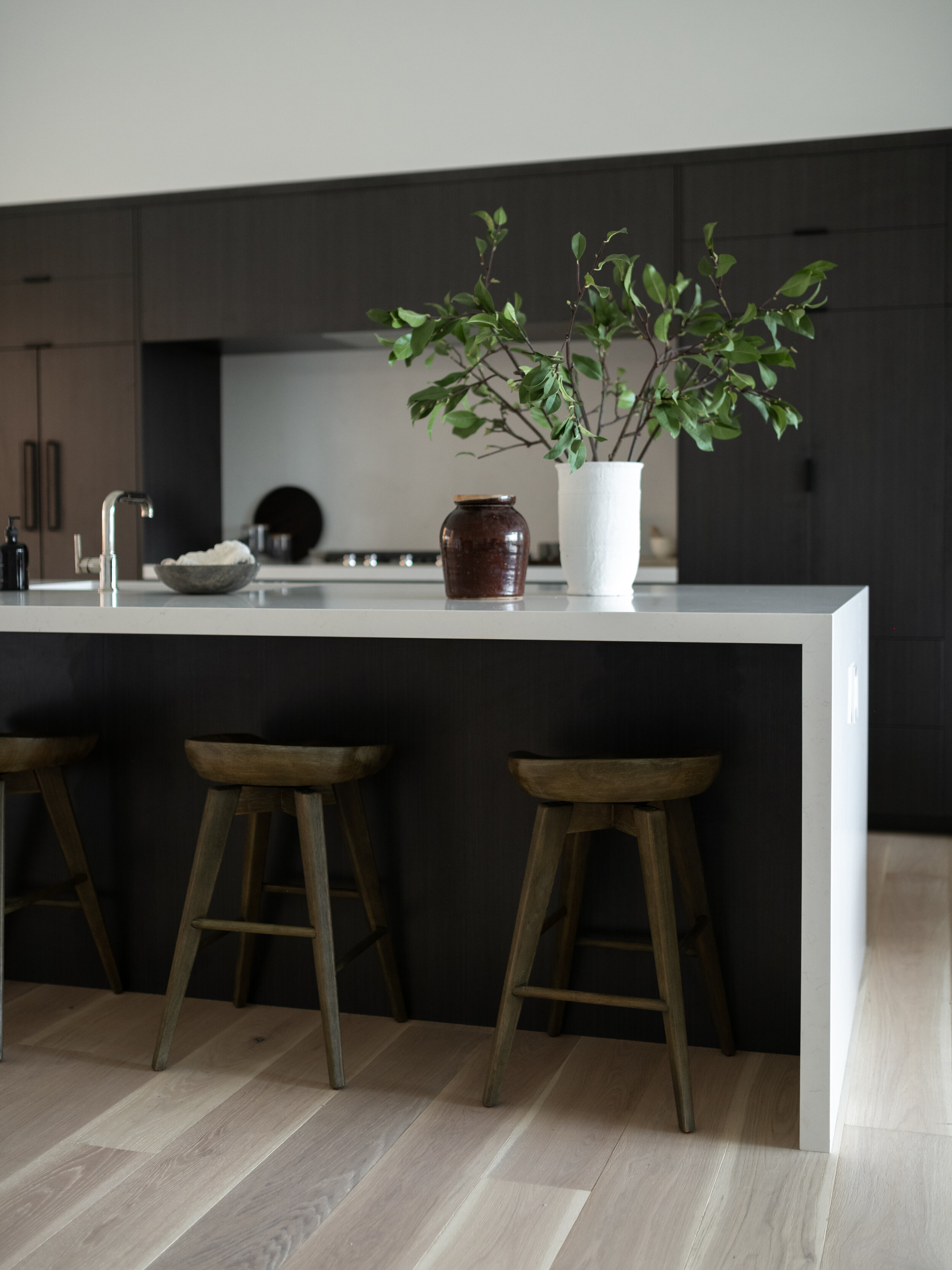
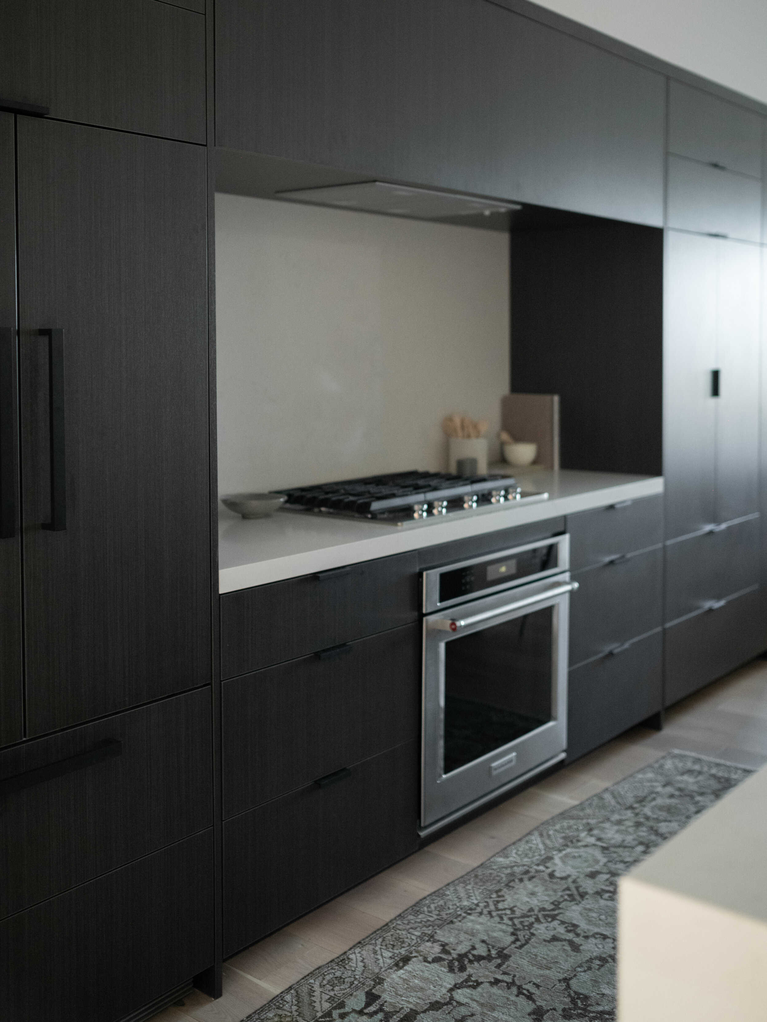
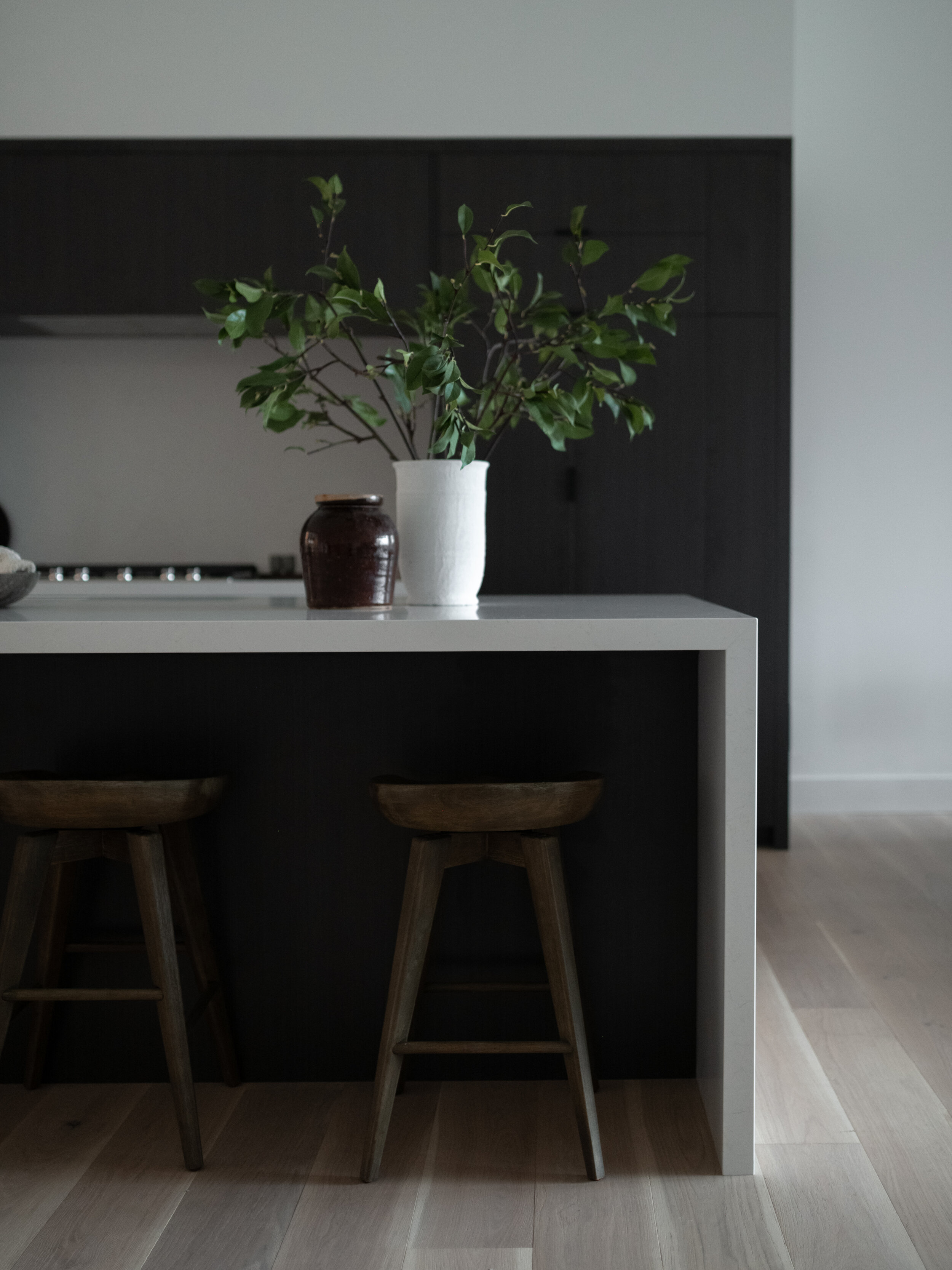
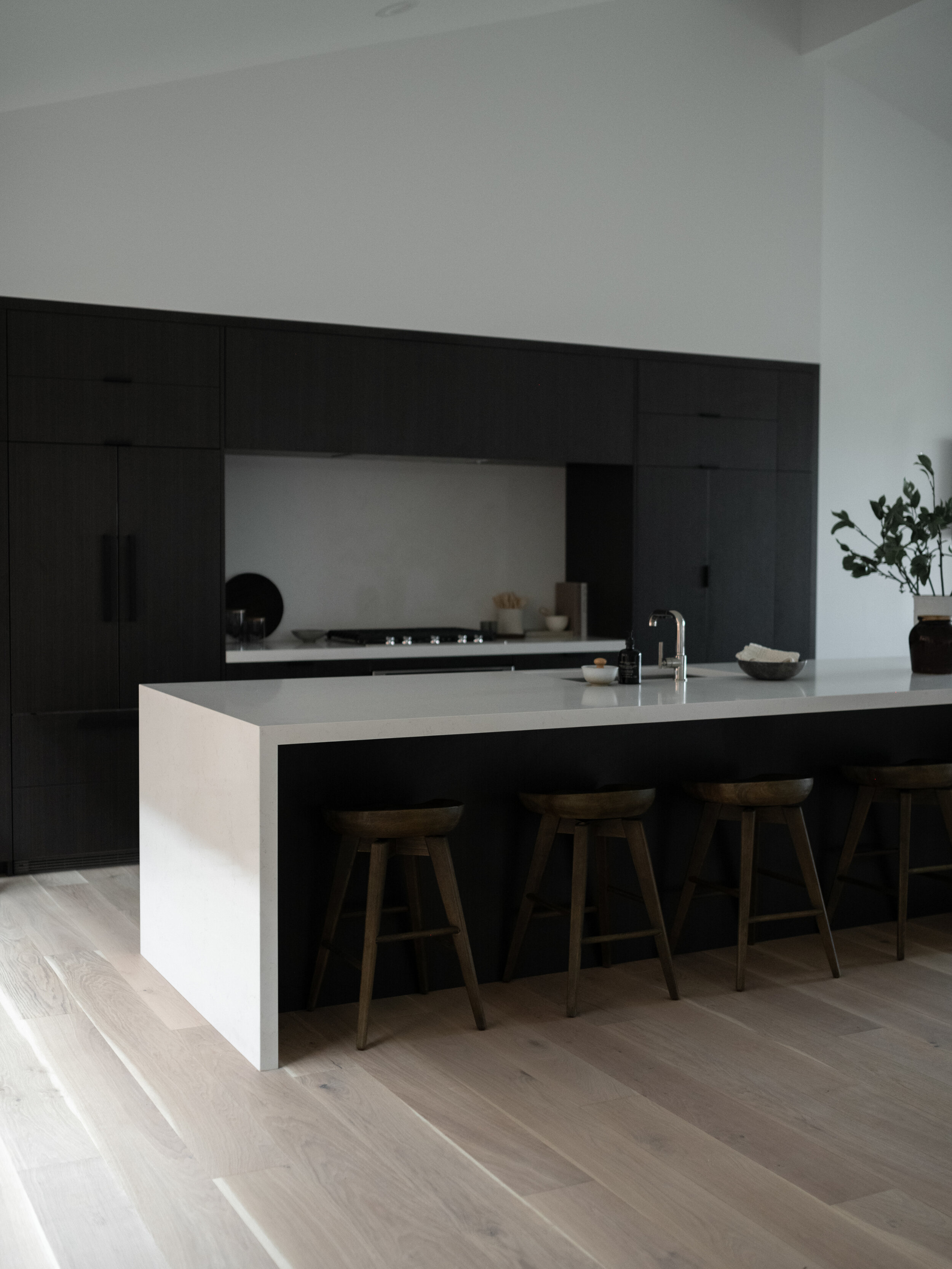
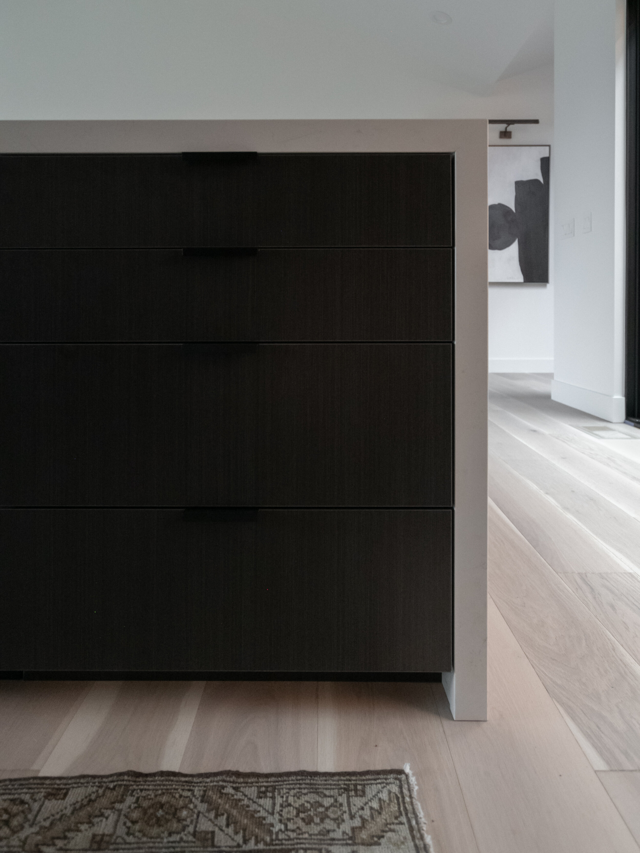
We’re starting by sharing the kitchen from the Avenues Minimal Project, because we believe strongly that the kitchen is the heart of the home! This kitchen design is simple and minimal in aesthetic, with an Australian nod. Our clients wanted clean lines, we accomplished that look like adding luxury vinyl cabinet fronts that look like dark wood (without all the grain), and waterfall countertop on the island. The hardware is minimal, and we added panel ready appliances to make the kitchen look symmetrical. For such a minimal design, we highly recommend paneled appliances!
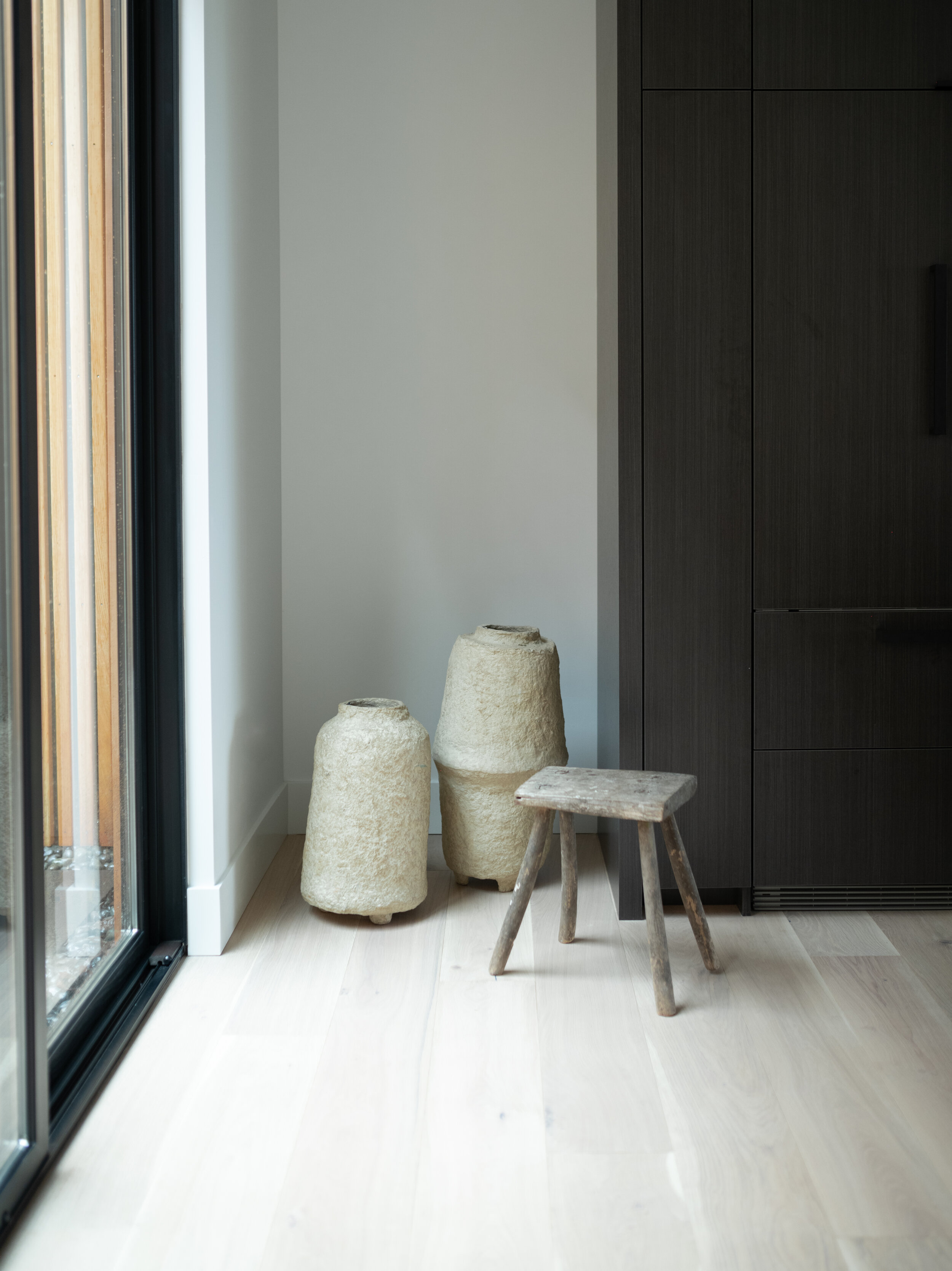
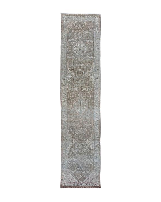
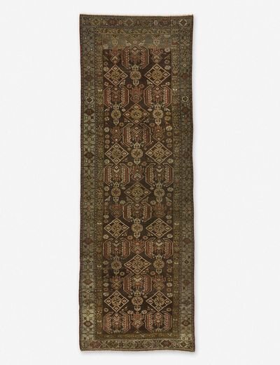
We added warmth to the kitchen by bringing in a vintage runner and textured accents.
Our client wanted an extra long island, because they love to host! We love that it spans the entire width of the perimeter cabinets.
We wanted the floors and the cabinets to contrast, so we went with wide plank European white oak engineered floors and dark wood inspired cabinets.
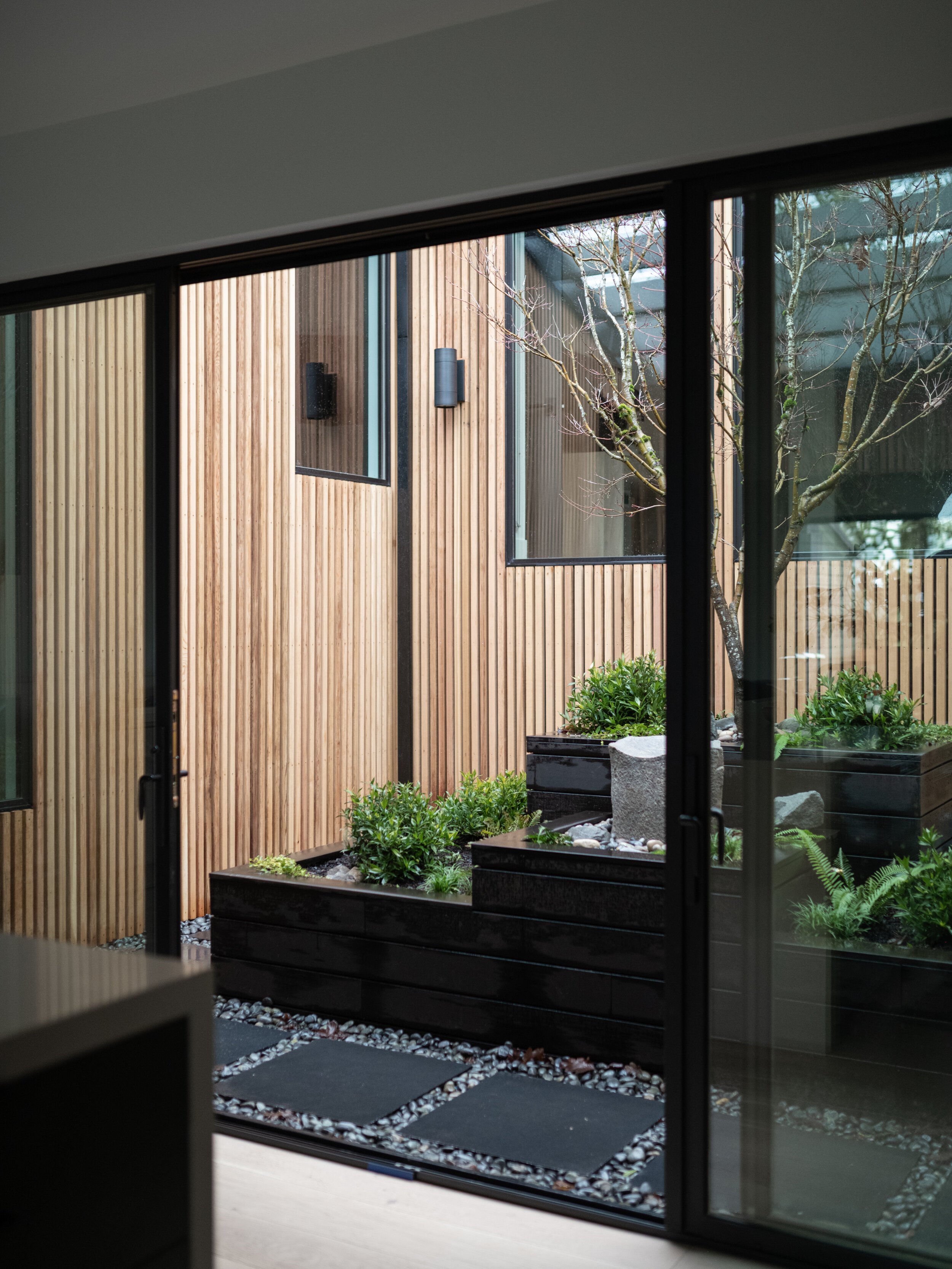
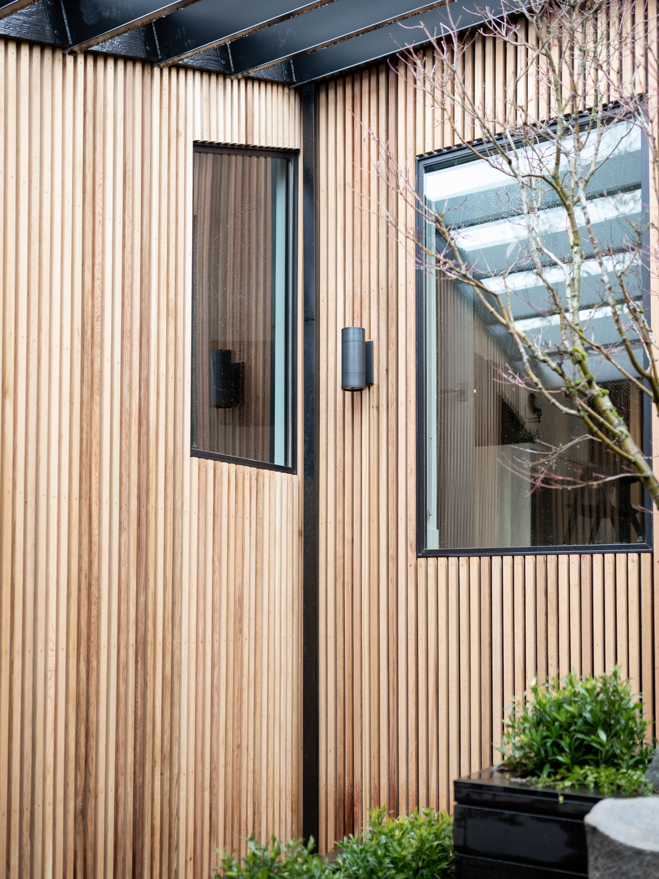
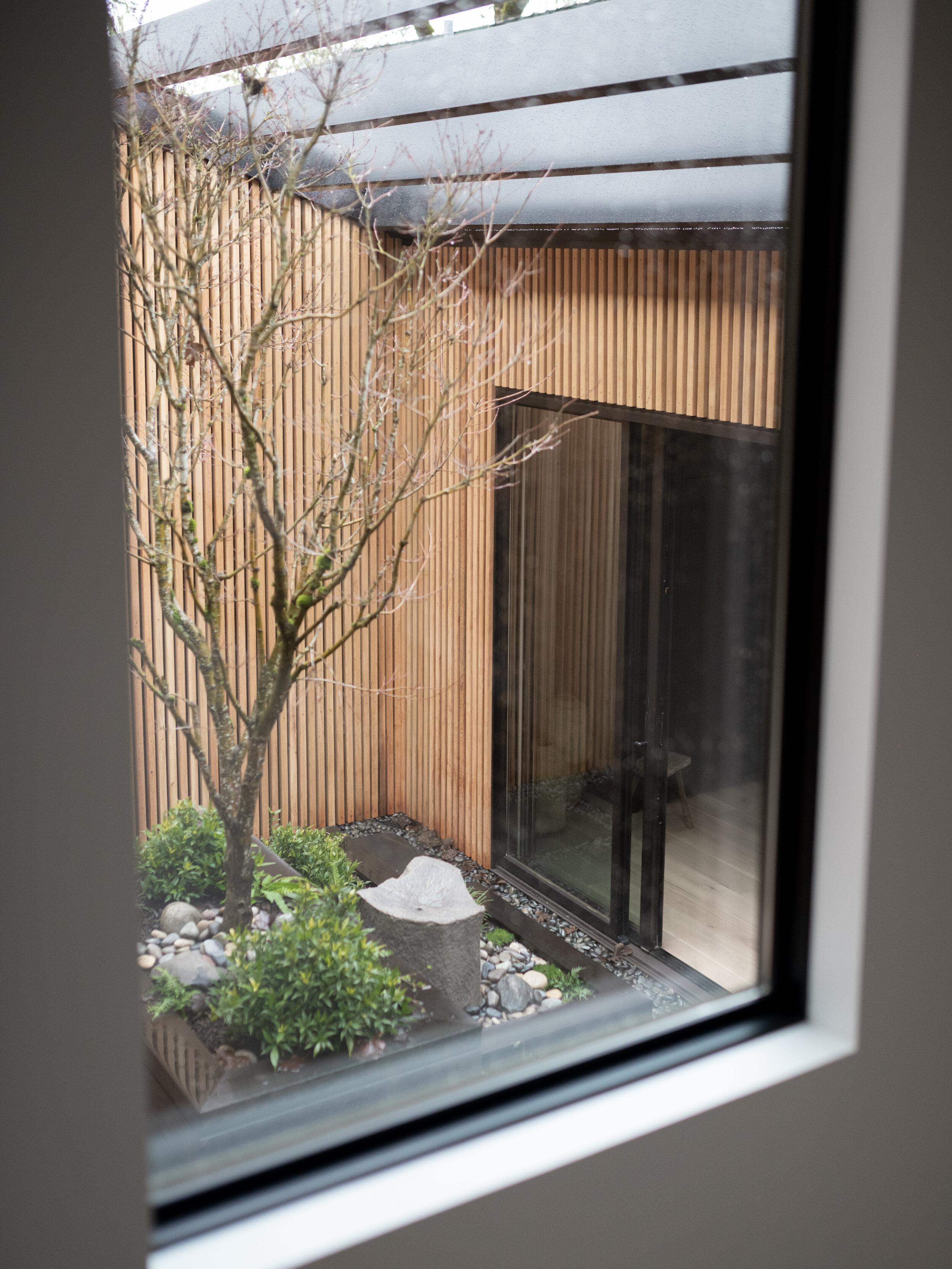
Did you notice the courtyard off the kitchen? We absolutely love this charming feature! We completely redid this courtyard, helping bring inspiration to the space. Our client worked closely with a landscape architect to bring it to life.
Every little detail matters and was thought through, and we love how it turned out!
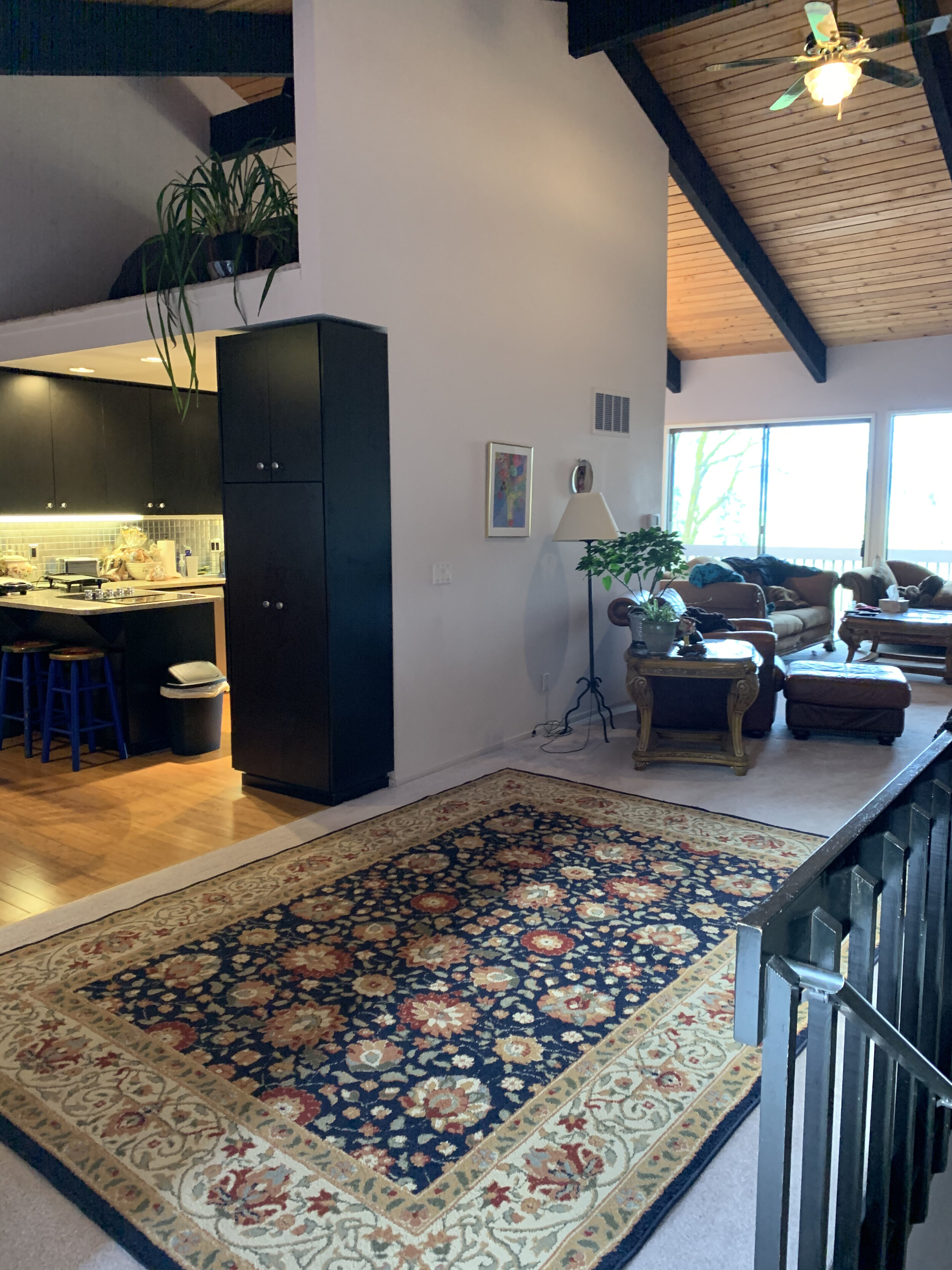
Check out these before pictures! Can you catch the vision ;)
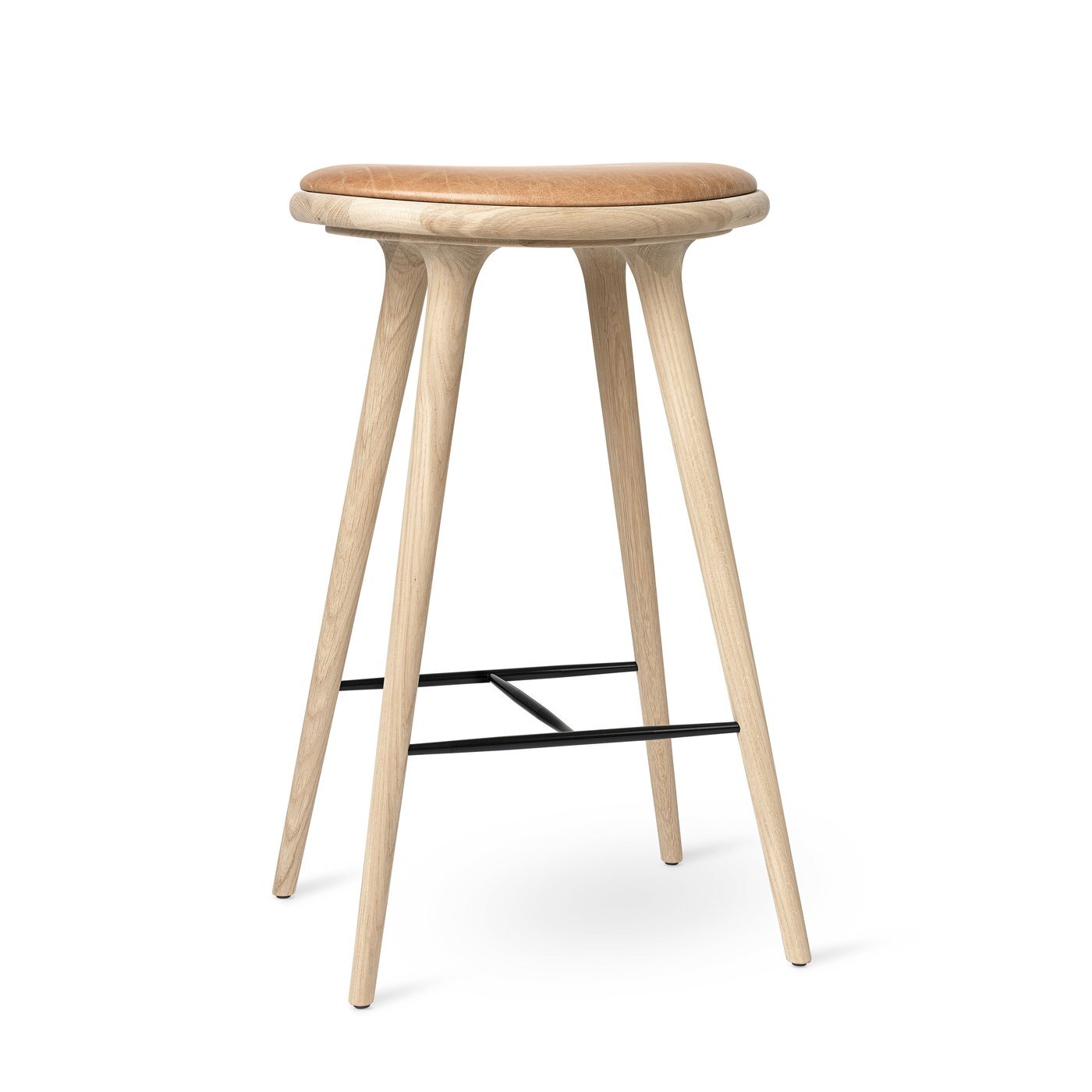
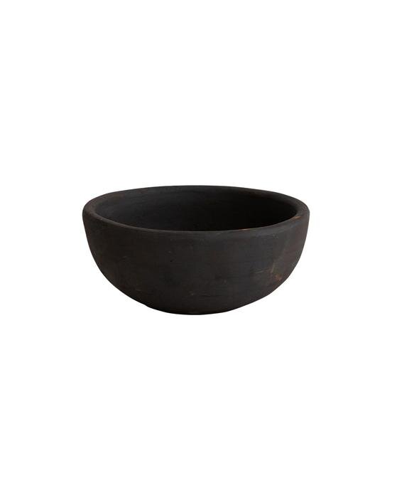
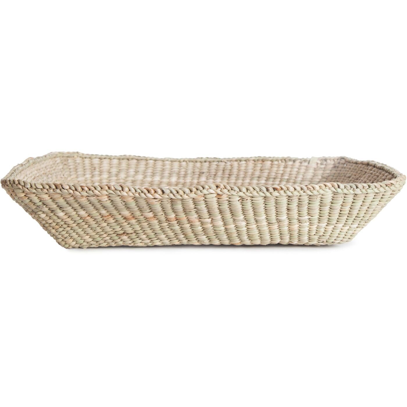
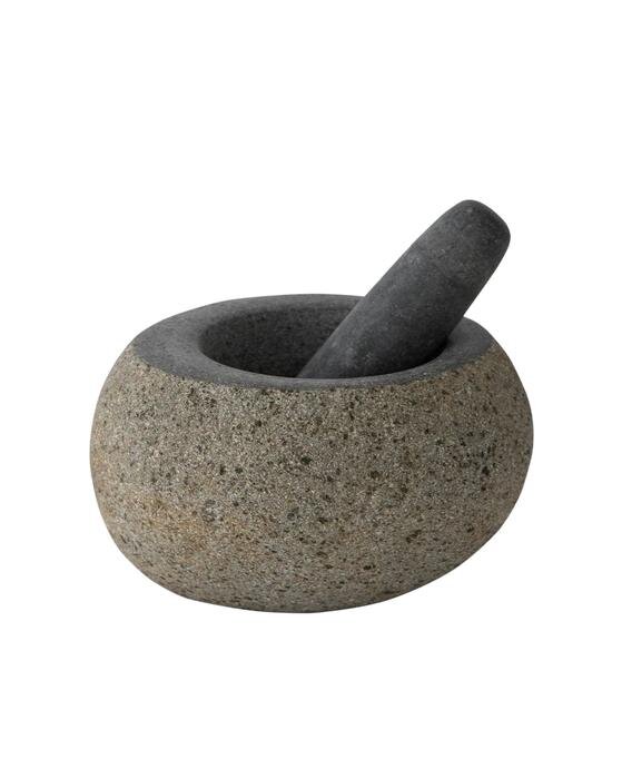
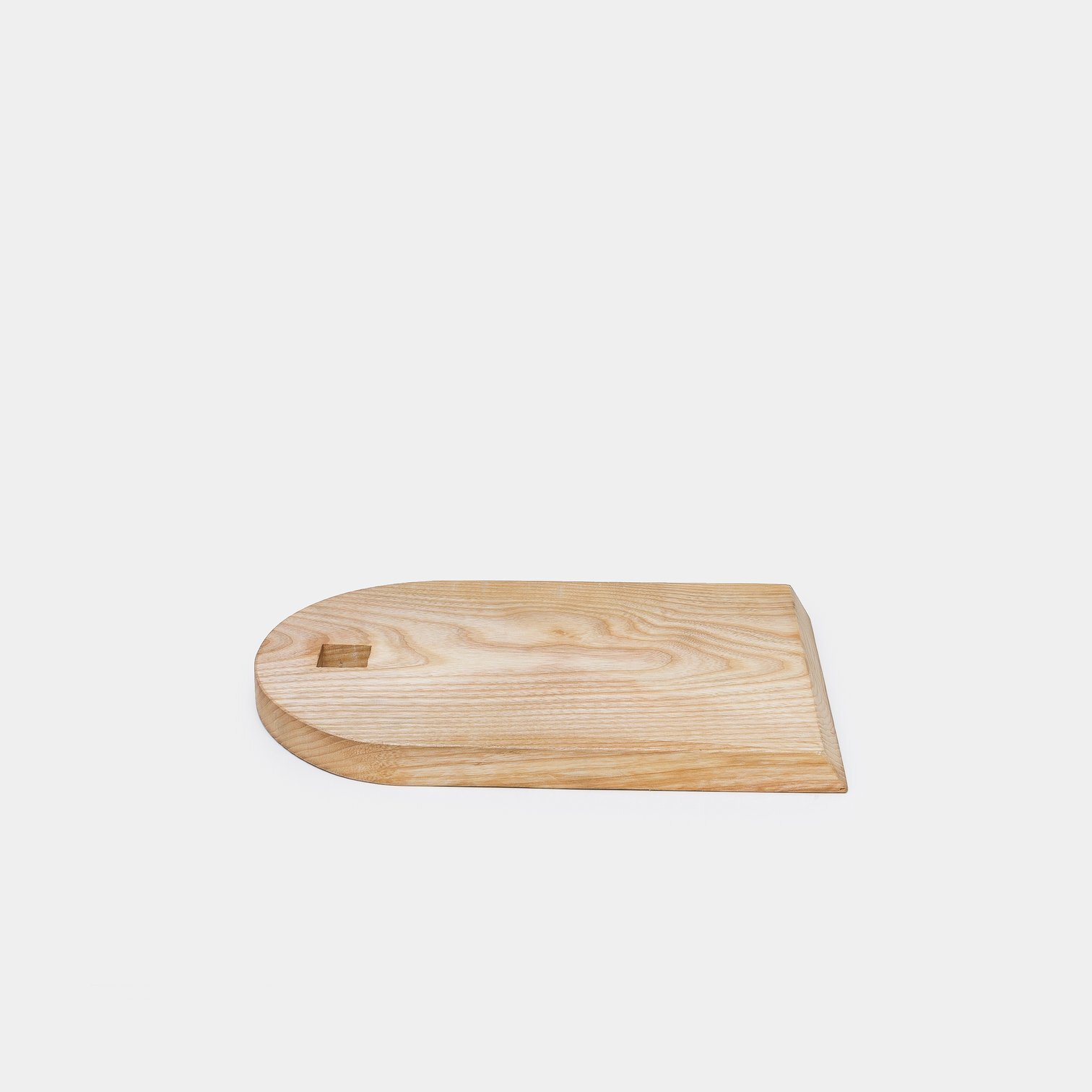
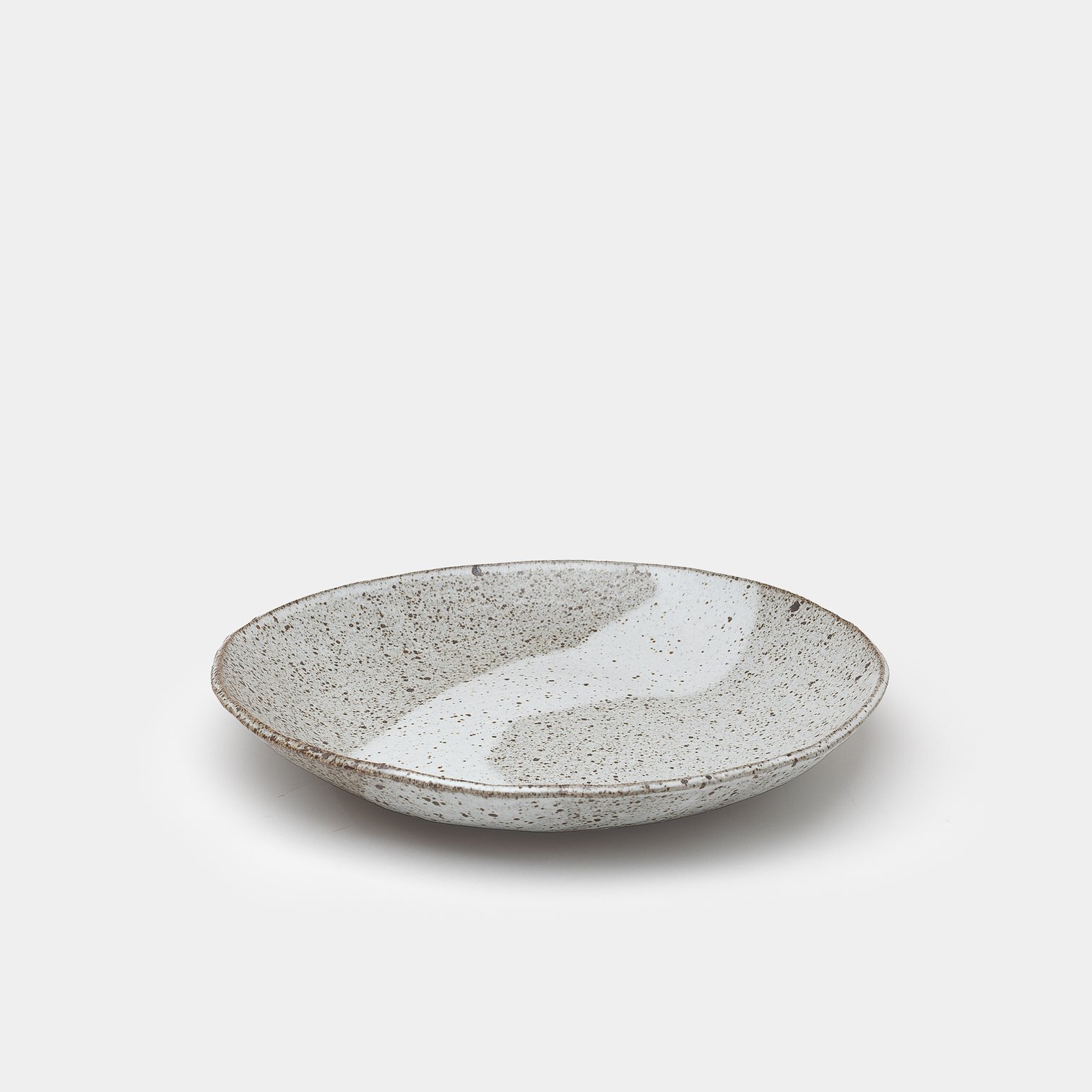
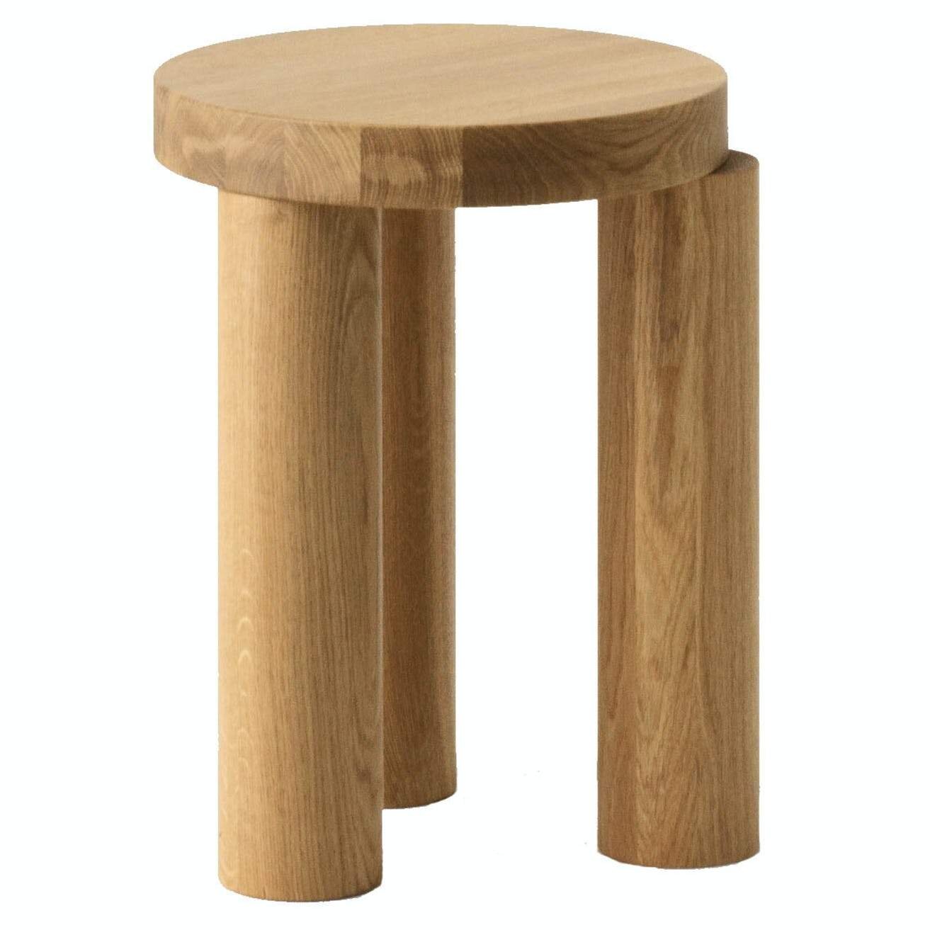
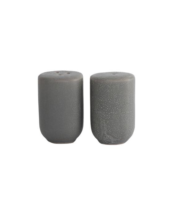
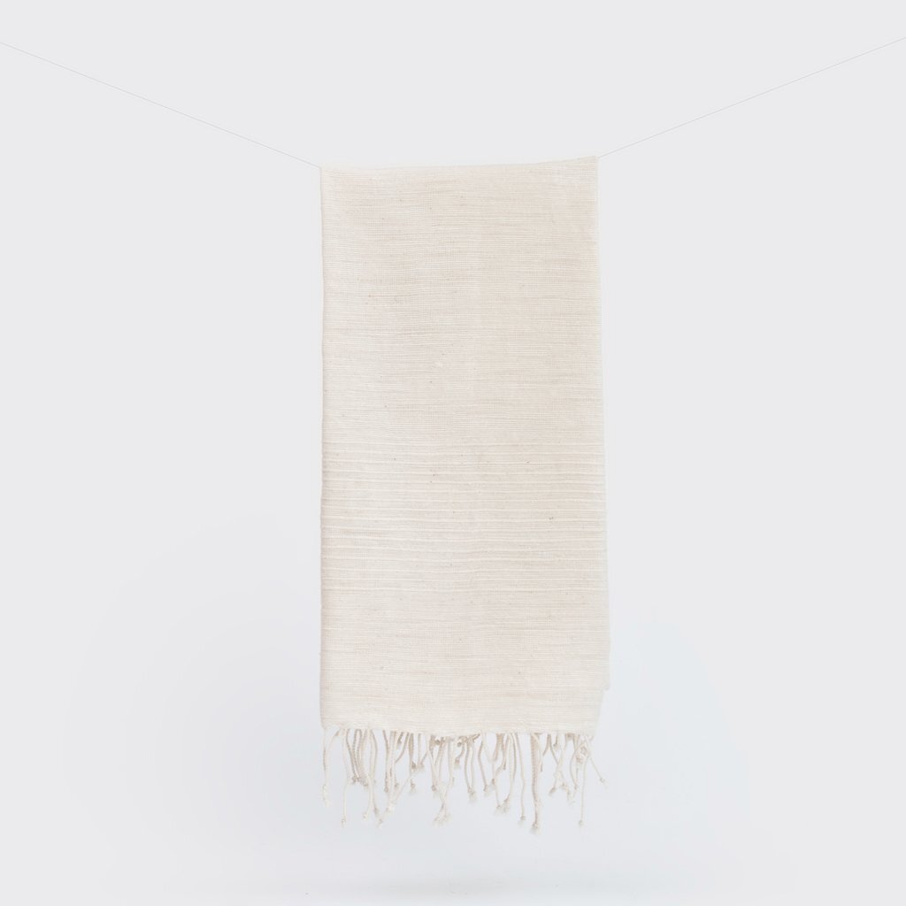
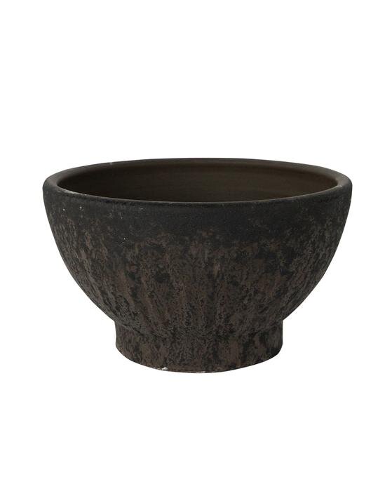
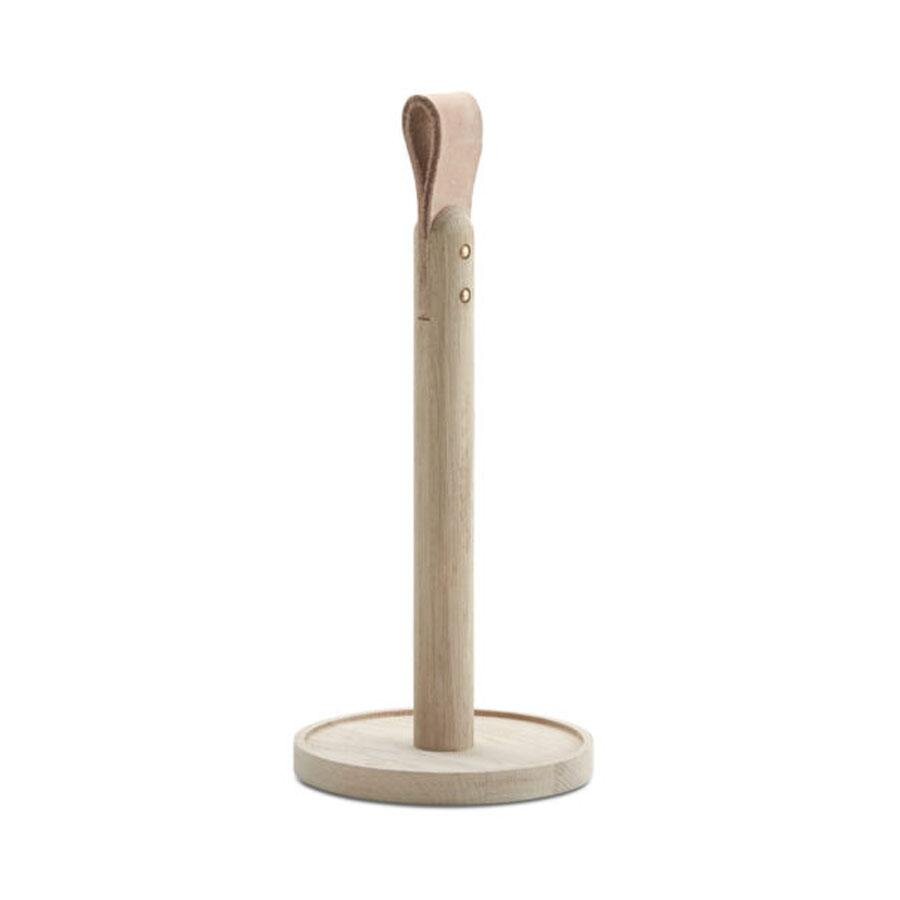
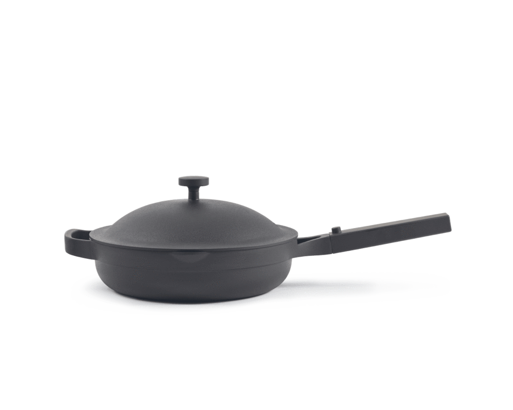
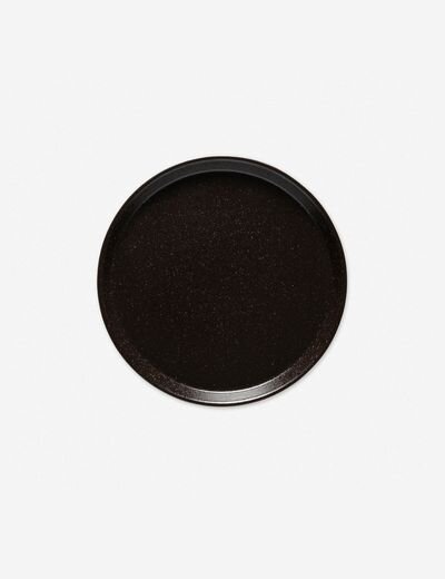
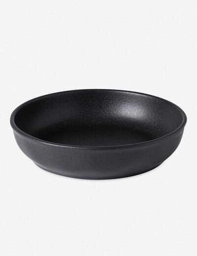
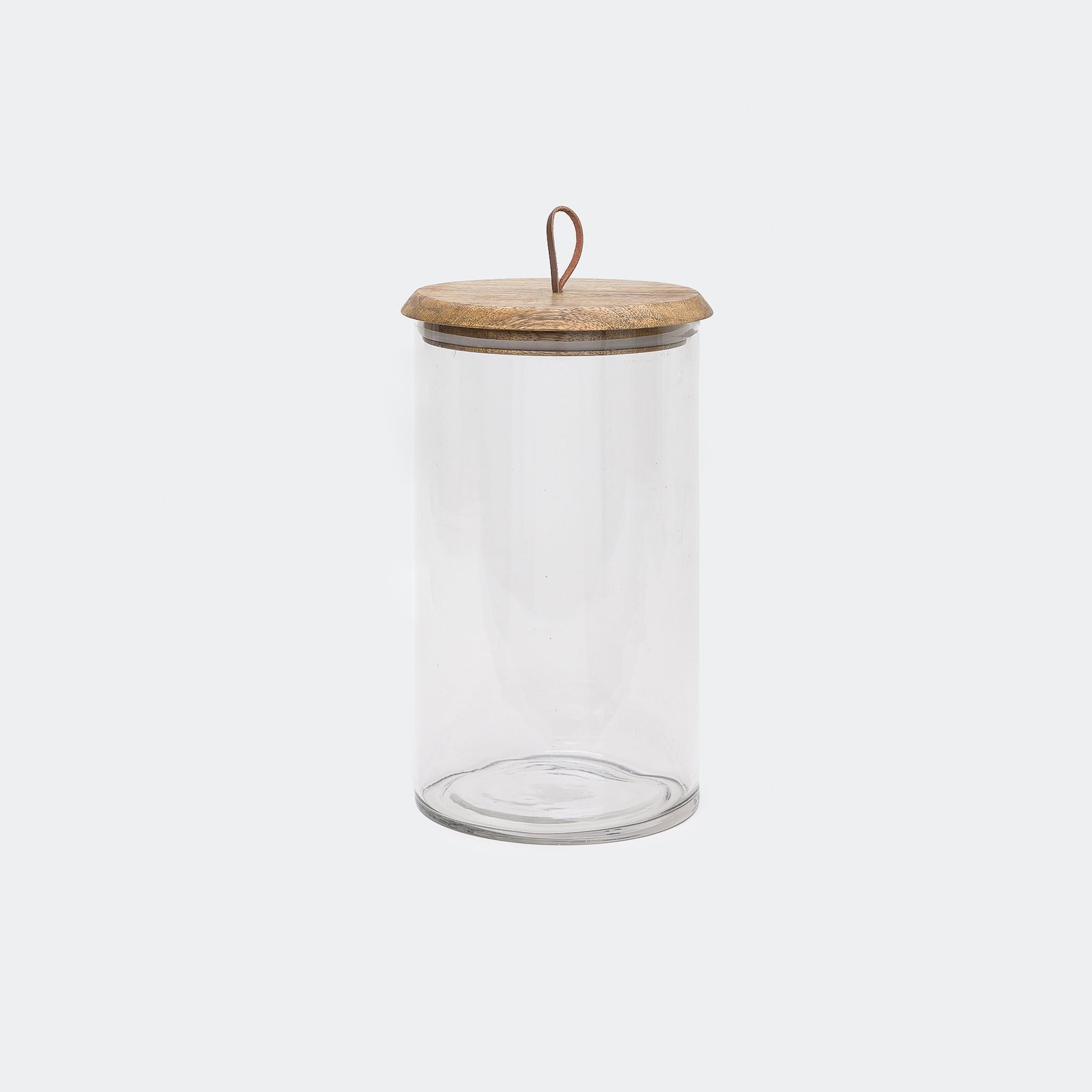
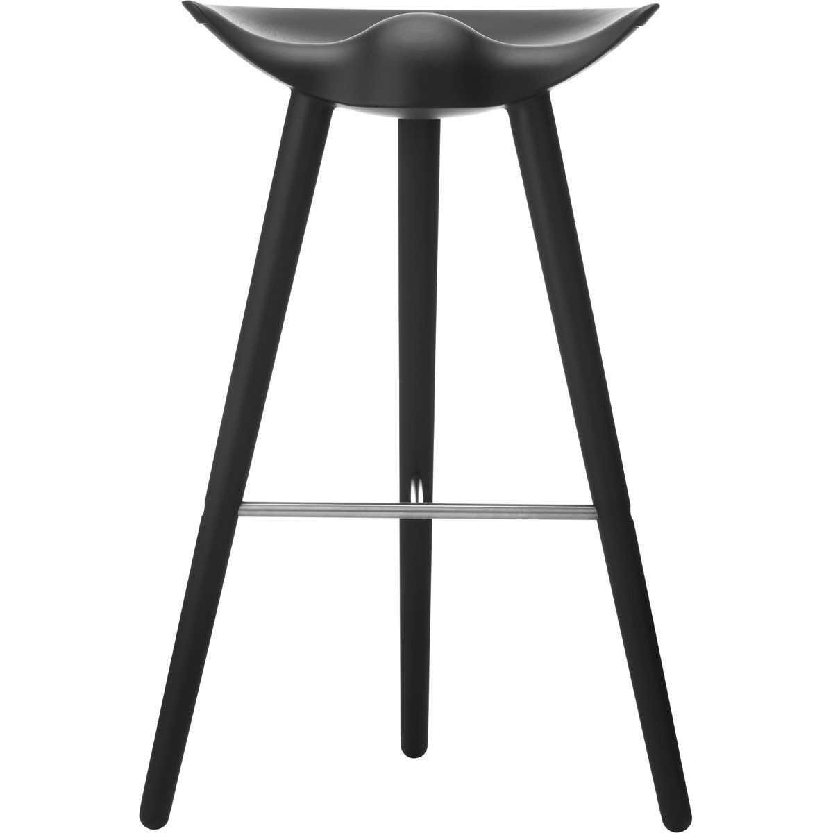
For Full Service Projects, we don’t share the identical products, since our clients pay for these services it wouldn’t be fair. We do however share pieces that inspire a similar aesthetic! Here are some of our favorite pieces, with a minimal aesthetic!

