Cottage in the Woods Project
Welcome to our #cottageinthewoods project! You may have seen the dutch-inspired dwelling on our latest Architectural Digest article, but we are so excited to reveal this project to you with our own house tour! The transformation of this very outdated home to a charming modern day cottage with bold characteristics holds a special place in our hearts. Why? This cottage is our co-founder, Aymee’s personal abode which makes it all the more exciting! We designed this home with innovation top of mind. Aymee and her family knew they wanted to remodel their newly purchased one story home with a cornucopia of earth tones and unconventional yet traditional details that didn’t jeopardize the existing heritage elements of the house.
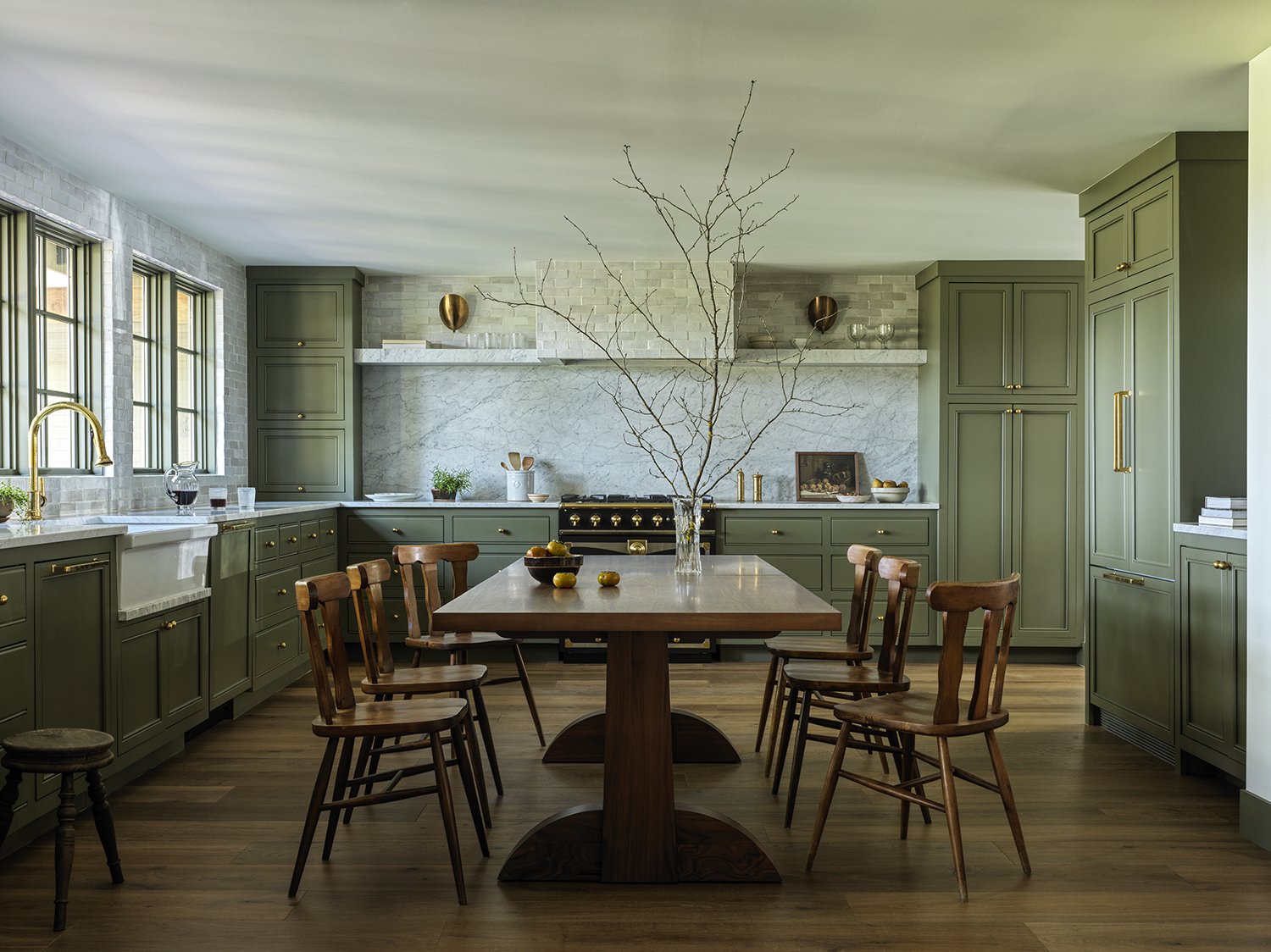
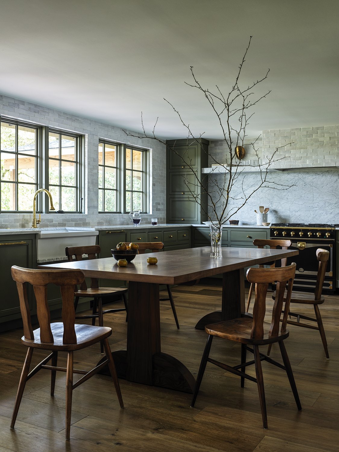
The kitchen has always been the heart of the home in the Kuhlman family so it was important this space felt very communal with the primary purpose of gathering around the table and indulging in provisions. We did something a little unique here and made this room their “Eat-in” kitchen” translates: (no island). This really sets the tone for comfortability throughout the home and inclines people to sit down (in vintage chairs of course) and enjoy candlelit conversation with something brewing on the stove.
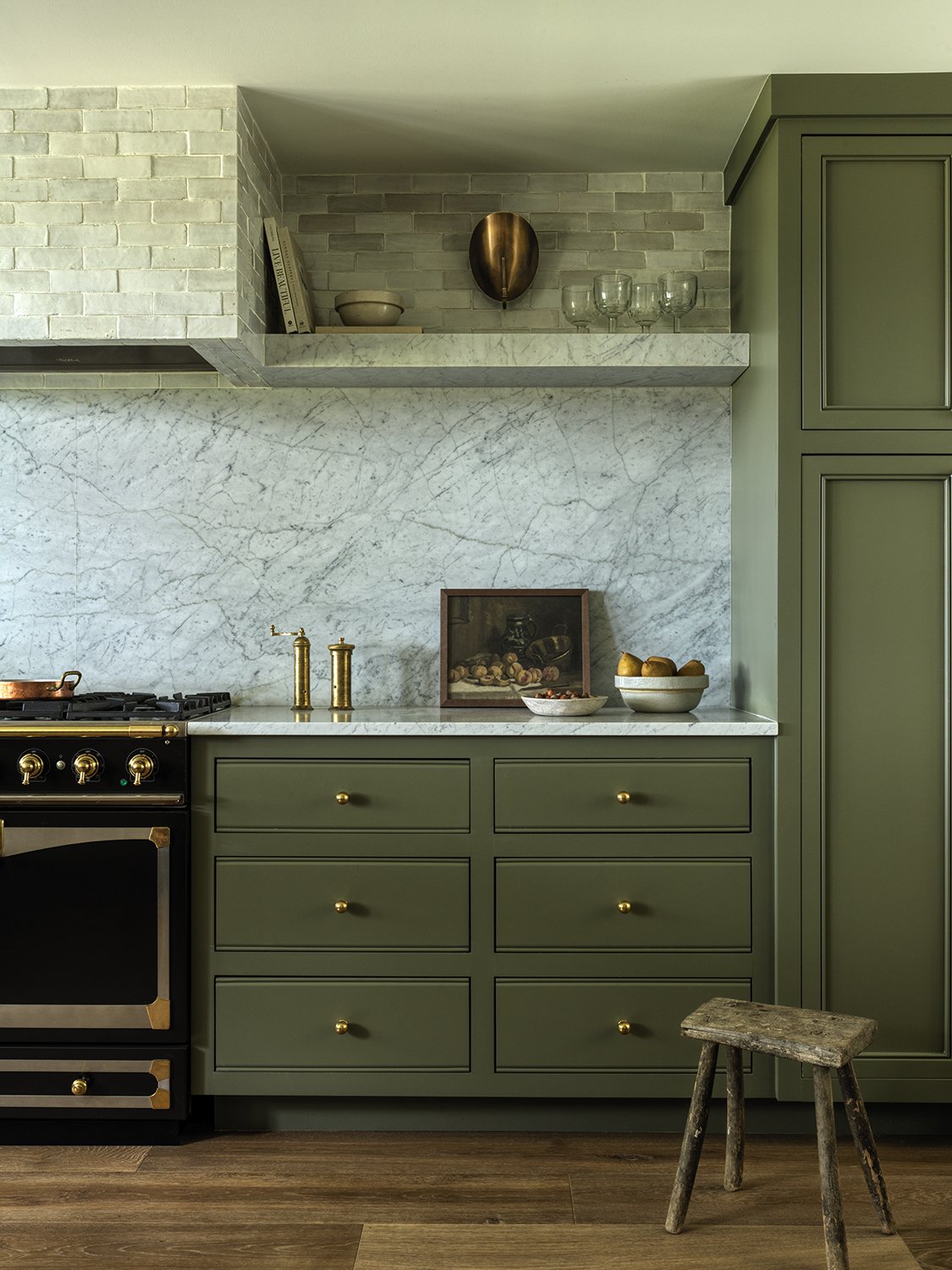
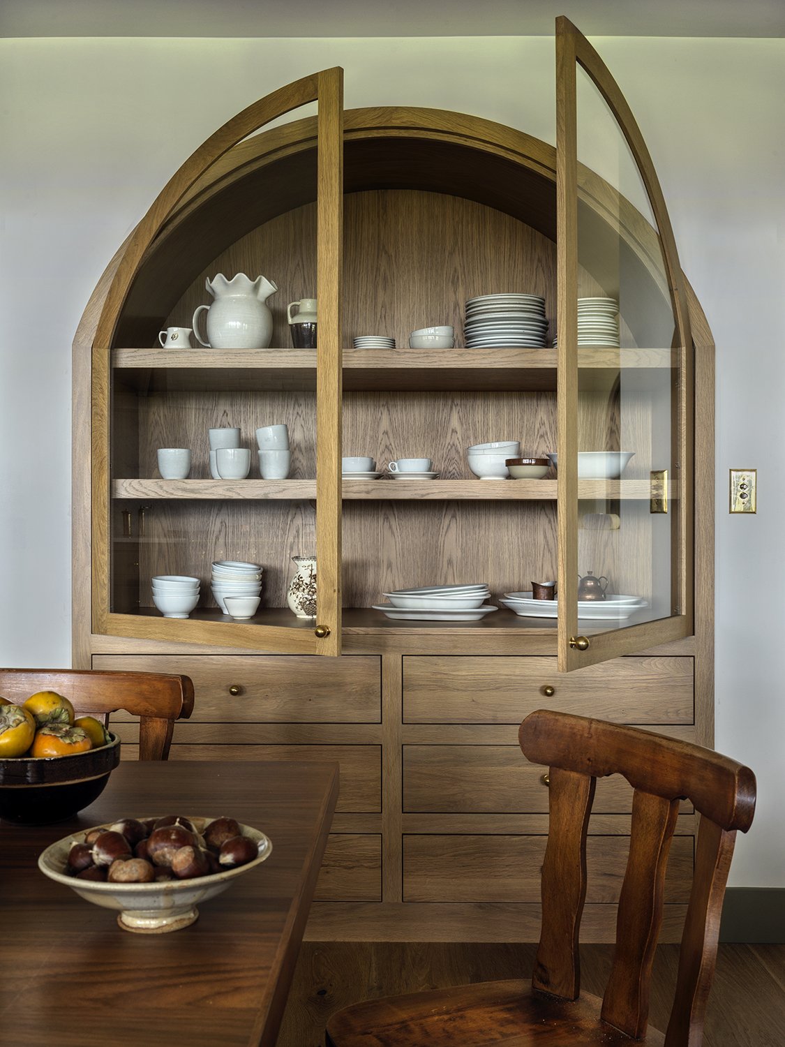
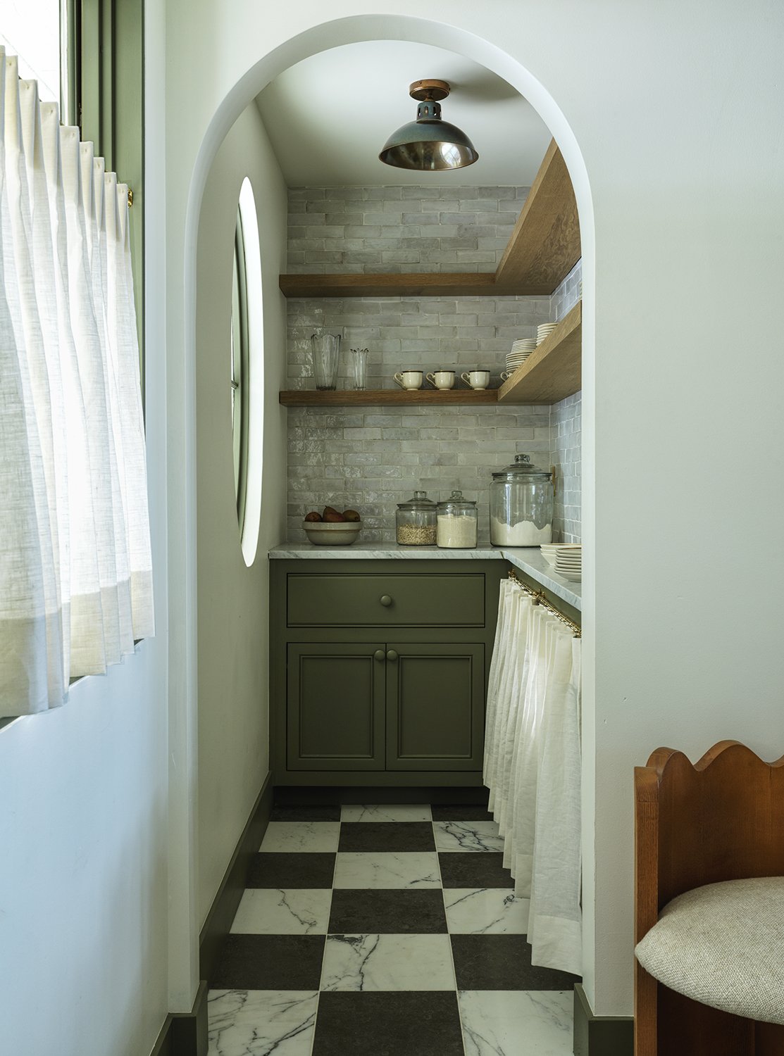
The natural light with the row of windows adds such a beautiful ambiance and the arched cabinet provides easy access for grandma’s china and a nice form meets function moment with extra storage. That backsplash gets me every time. The handmade element has such a wonderful texture and is the perfect juxtaposition from the unlacquered brass plumbing.
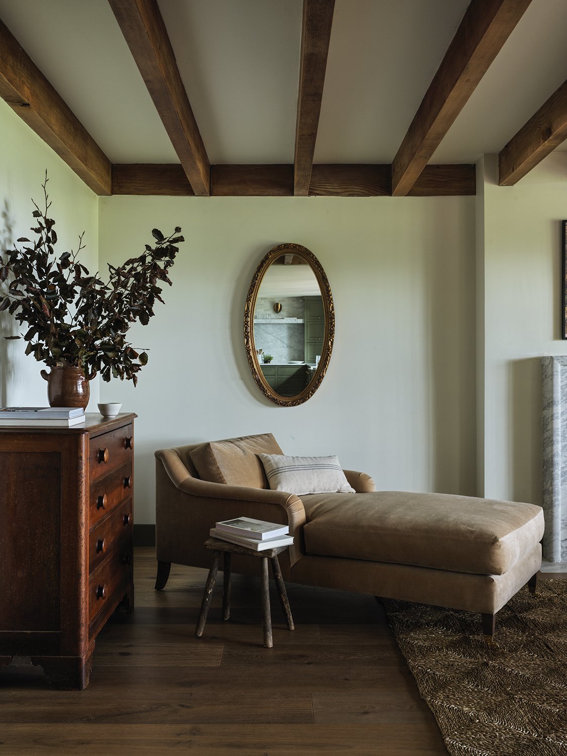
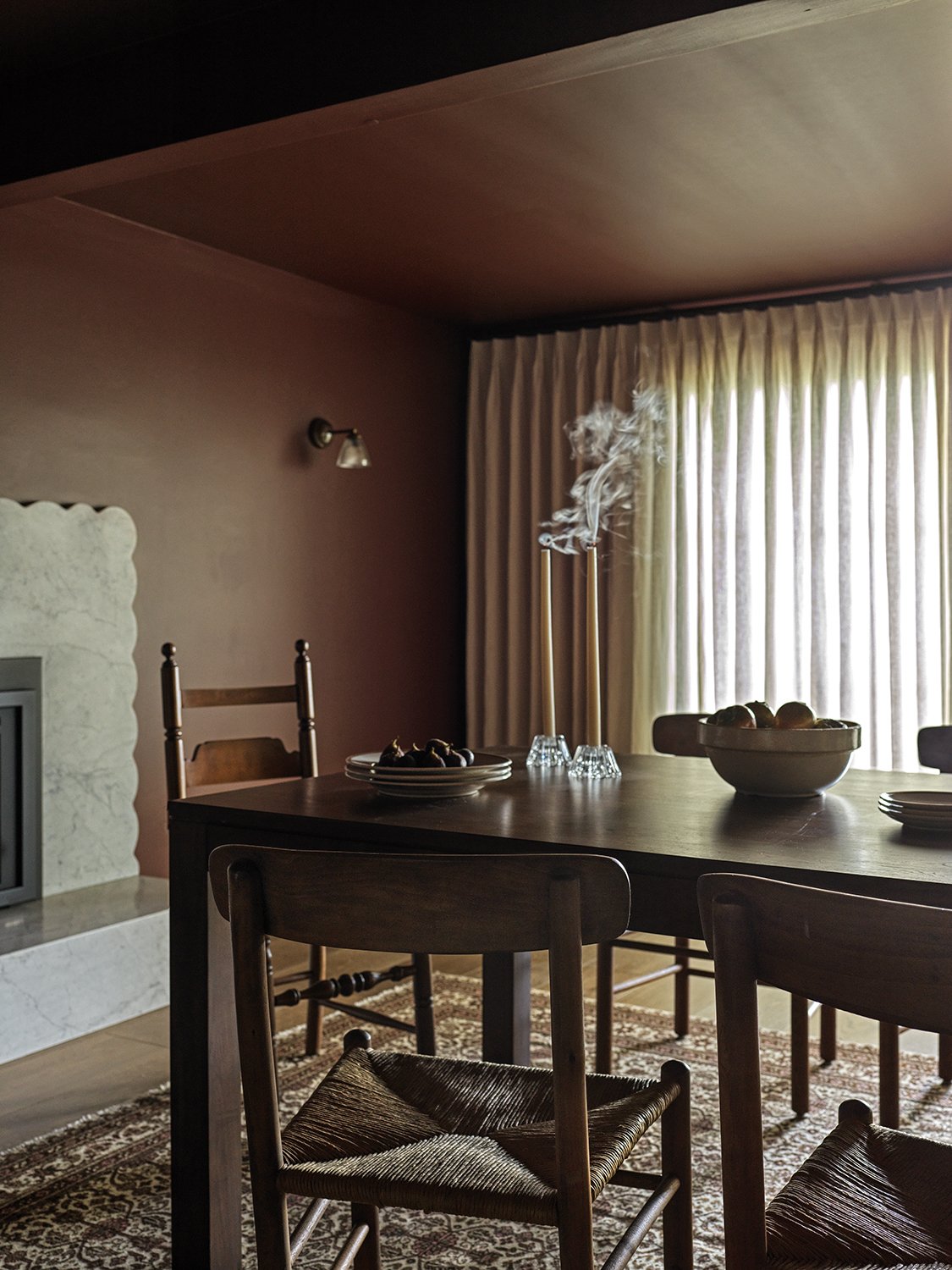
One of our favorite elements of the home (beside the surrounding terrain of regional PNW trees) is its open yet definitive use of spaces. There is an influence of open-concept; however, a lot of the rooms have a private and intimate feeling. We really took advantage of the “coziness” of the low ceilings, warm accents, and luscious views. As soon as you walk in, you see the original beams, marble fireplace, a row of windows, and that yummy green contrast trim color. We utilized color in really inventive ways in the home.
Paint Colors
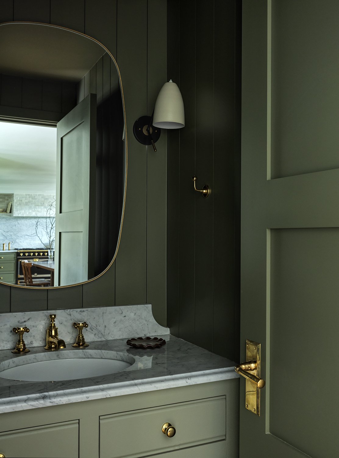
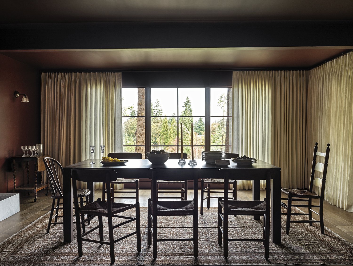
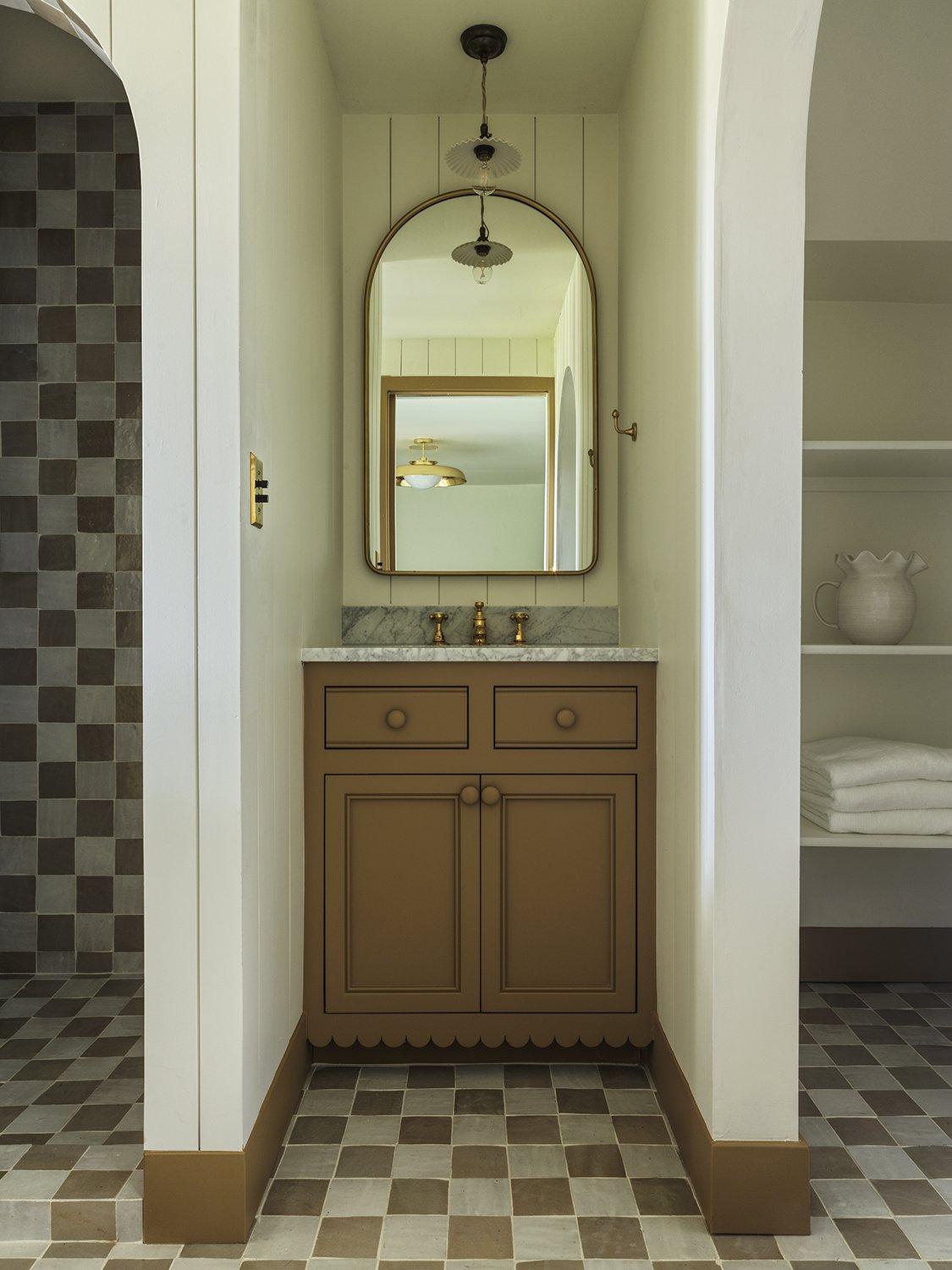
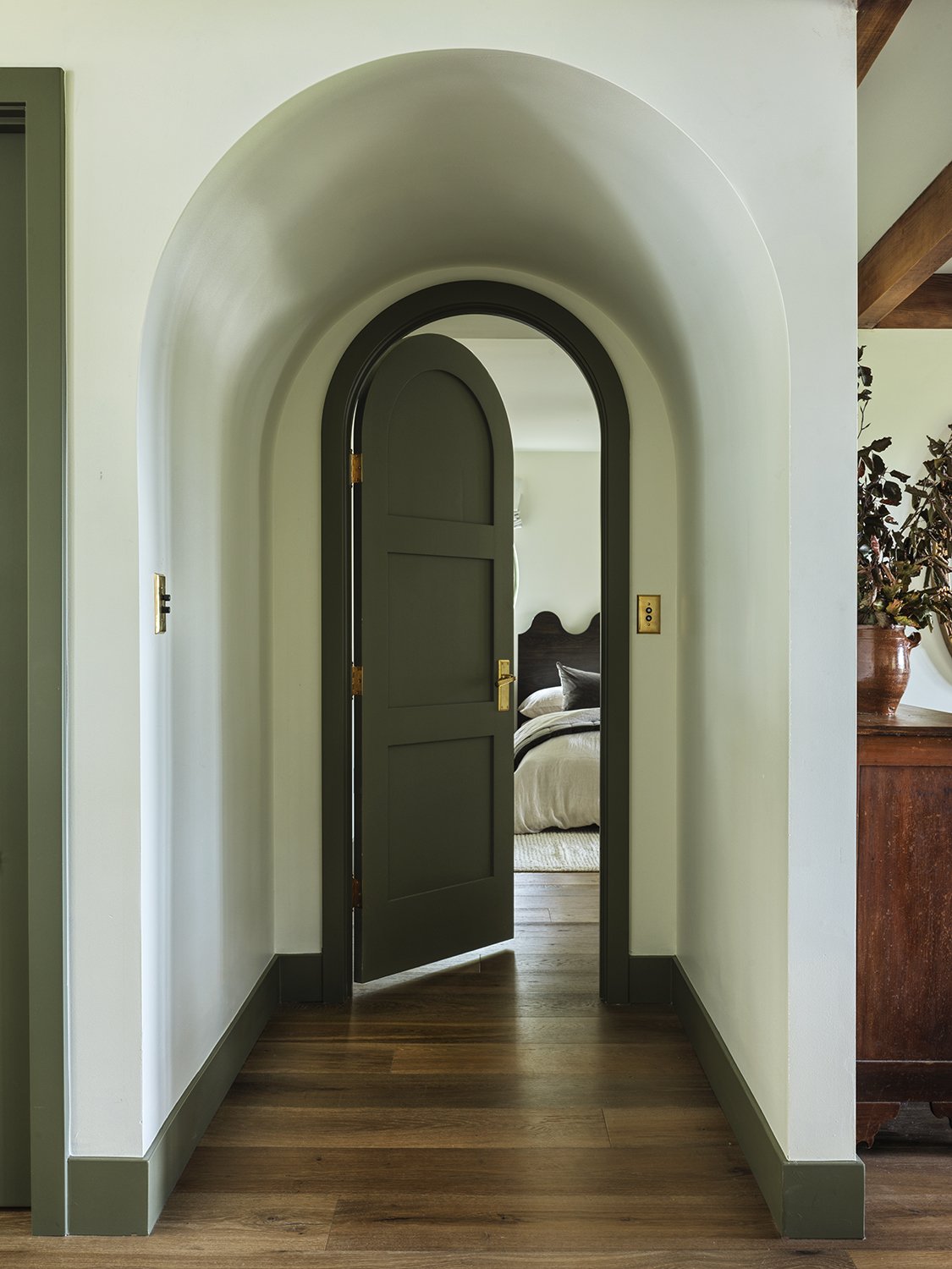
From the green trim throughout (Smoky Forest by Dunn Edwards) to the baked cumin scalloped vanity (Baked Cumin by Benjamin Moore), rich reddish brown (Deep Reddish Brown by Farrow & Ball) in the formal dining and cocoa wall color in the powder (Broccoli Brown by Farrow & Ball), paint helped create coziness despite the open plan design. The white paint color used throughout the home to compliment all of these hues was Simply White by Benjamin Moore.
Our custom furniture fits perfectly in this space, which combines iconic silhouettes with less conventional design details and it is so important to us that it is made out of sustainably harvested oak—with luxurious results. Shop our Frankie Stools here! Rugged and elegant at once, the transition into the breakfast nook and dining space is seamless!
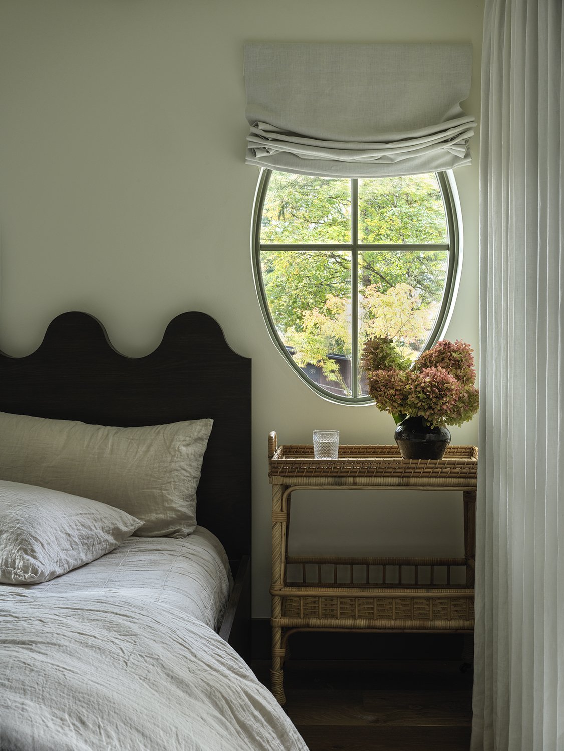
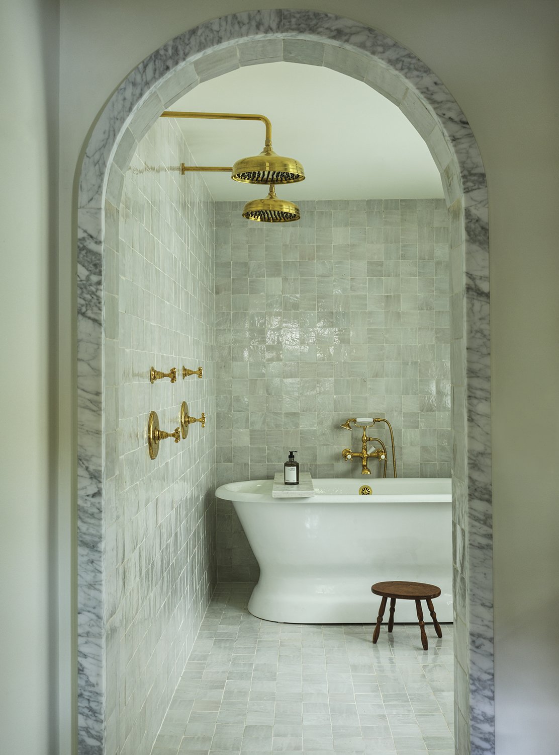
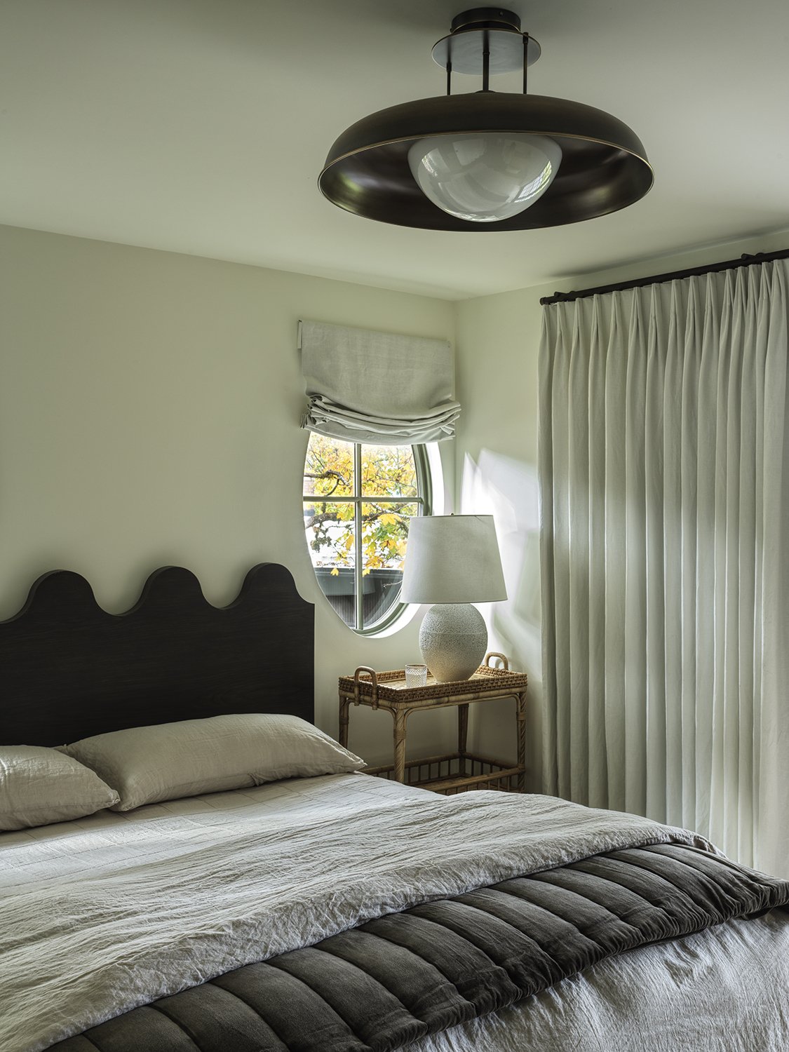
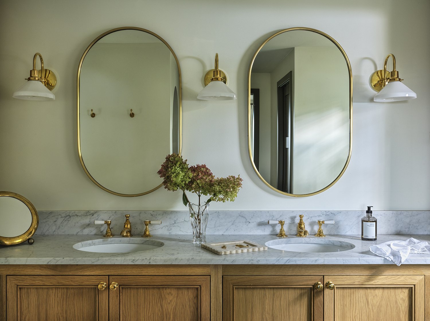
The primary wing of this home is extra special…An arched doorway greets you at the entrance of the primary suite. Two oval windows flank our custom wave bed (coming soon) and the row of doors juxtaposed with linen drapery gives the allure of an indoor/outdoor oasis. The primary suite has one side for sleeping and the other for bathing and dressing. The tub has to be one of the most relaxing places in the home….
A note from Aymee:
My family and I are so obsessed with every detail. This was such a fun experience and I honestly couldn’t do it without Molly and the team pushing me out of my comfort zone and personalizing every charecteristic to be whole-heartedly home for us. Everyone who walks in the house says “this feels like Aymee” and that’s what we dream of for our clients: a space that is the perfect reflection of you. Now the hard part…comment your favorite room below!!!

