Kidd European Farmhouse Design Refresh - Part Two
Today we are excited to finally reveal the Kidd European Farmhouse Design Refresh! We worked with some incredible brands on this project and love how the spaces turned out. As is on brand, the design was heavily influenced by some local vintage pieces which makes it unique and all it’s own, a feeling we bring to every project we work on. Since this is my home, we are able to share sources, so be sure to check out those below!
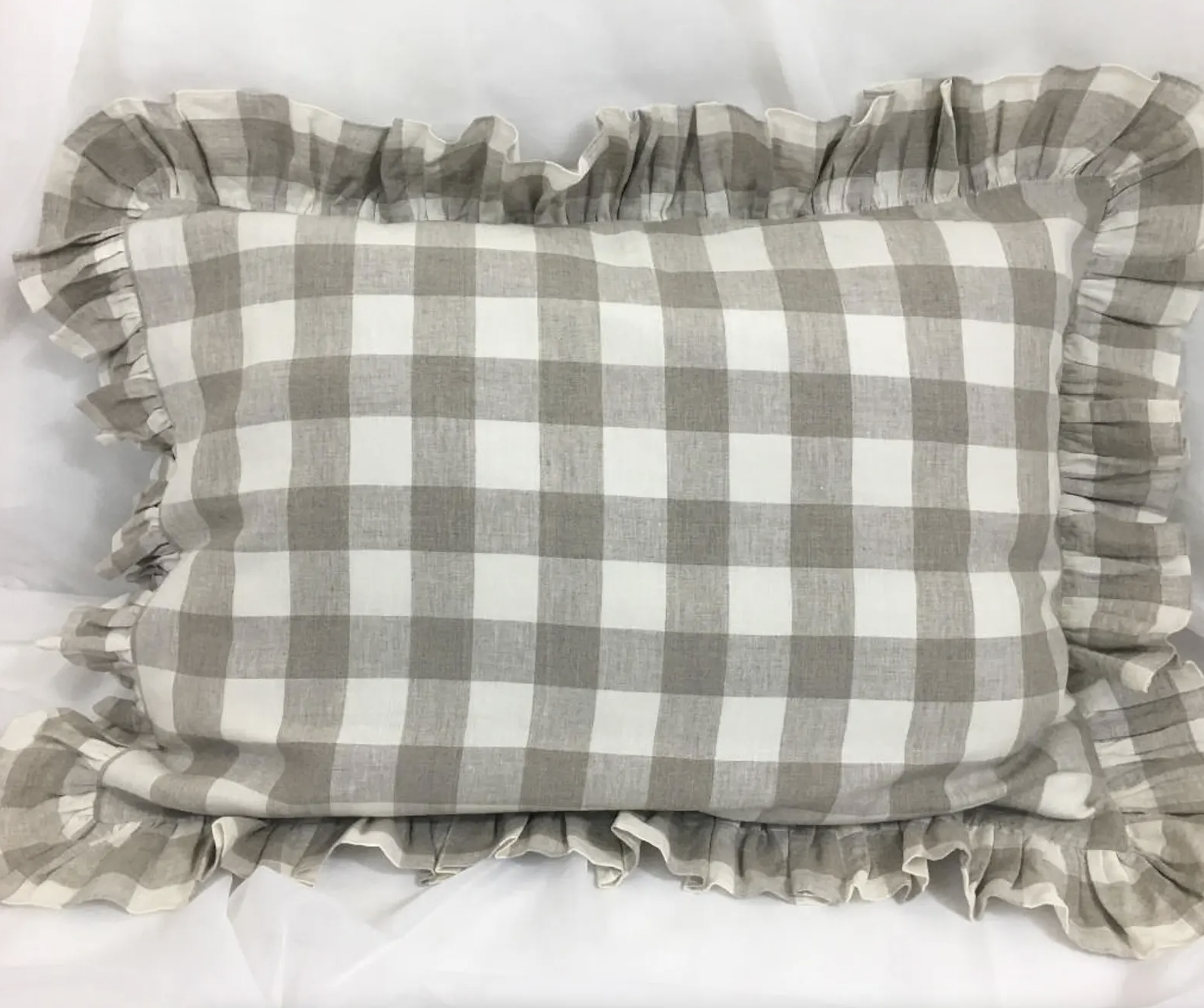
The kids’ rooms were really fun for me to create! I wanted to make sure that the space is reflected them and would grow with them over time. My girls share a room, so I needed to make sure that it worked for an eight-year-old and a four-year-old. It was a bit of a challenge because I didn’t want to have to redesign everything in a few years, instead I wanted to make sure that what I designed would work for both of them. We used a pink mauve color, "Romantic Smoke" by Valspar which doesn’t feel too young or too bright but it still definitely pink which the girls really wanted. We also had a lot of fun with the pattern in the bedding and curtains. I absolutely love the sconces in their room as well, they’re from Mullan and are super durable and have just the right amount of light at night so they can have those on when they’re going to bed or reading. The vintage dresser between their beds is a great place for storing books and and other things that they need and I like to incorporate vintage pieces in kids rooms as the quality is time-tested and holds up in rooms with lots of usage.
For my son’s room I was excited to do a green color and fell in love with “Messenger Bag” by Sherwin Williams. It’s a color that I think will grow with him overtime. He’s five and still young but I wanted to make sure in three years the design still worked, mixing up the patterns in the space helped with that as well.
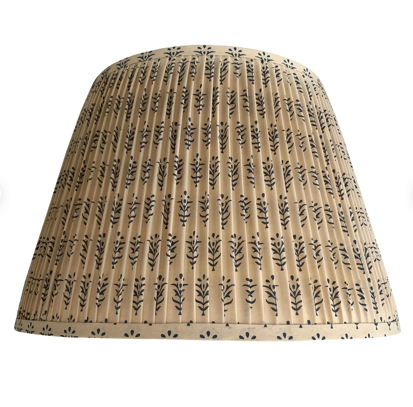
Another unique area in our home that I really love is the reading nook. It’s under our staircases right by our laundry room, the kids love to hang out there to read and color. The textile lampshade is one of my favorite features in the space! Our entry was another space that I wanted to refresh, you know we love a good check so I wanted to make sure that we included a checkered rug somewhere and instead of going with the traditional black and white, I wanted to soften things up with the brown and cream. Lastly, the powder bathroom was a place where we could experiment a bit with the design and I love how it turned out! We went with a dark and moody green, “Dark Olive” by Benjamin Moore and to balance it out, we dressed the storage under the sink with a curtain for that European look we love so much. And the sconce from Huey, is the perfect finishing piece.
Do you have a new build or remodel project coming up? Our design team offers expert level design with service options based on your project needs. We’d love to learn more about your project, inquire here.
Photography by Amy Bartlam
Click to shop sources:


