English Colonial
Meet our #EnglishColonialProject located on a beautiful property in Upstate New York. We uniquely reimagined this country estate and distinguished our design by its historic architecture, creating a dwelling that is equal parts past and present. Old-age European lifestyle and new-age sustainability are some of the hallmarks of our work and this home was intentionally imbued with character and richness, using vintage wherever possible.
Living
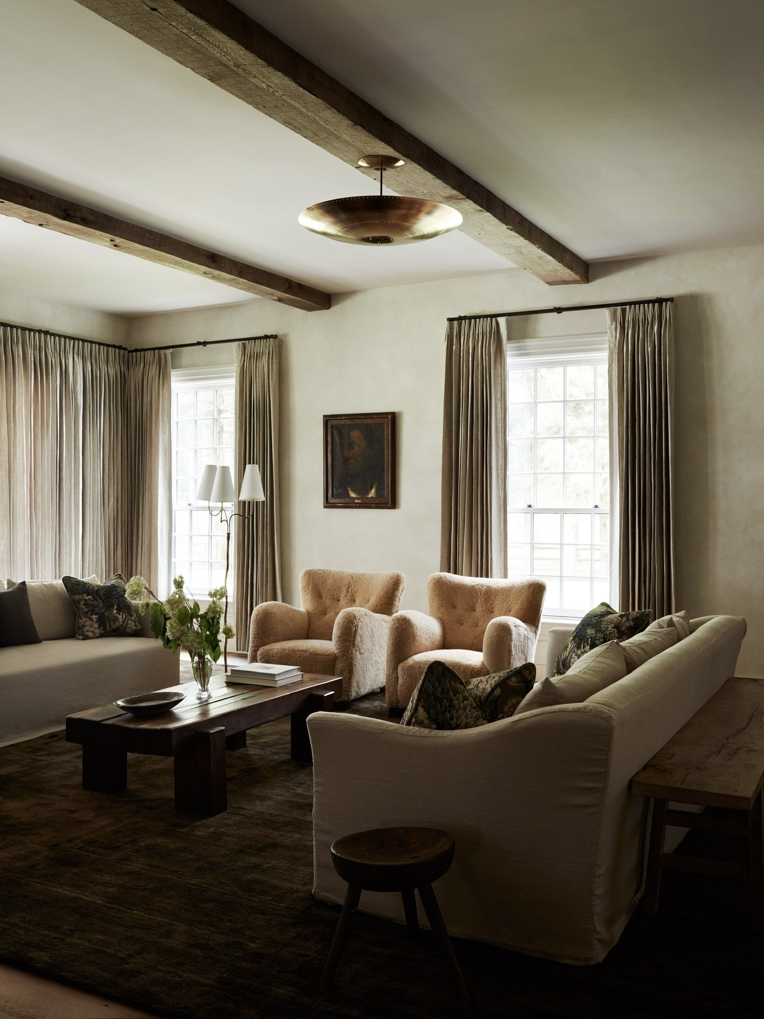
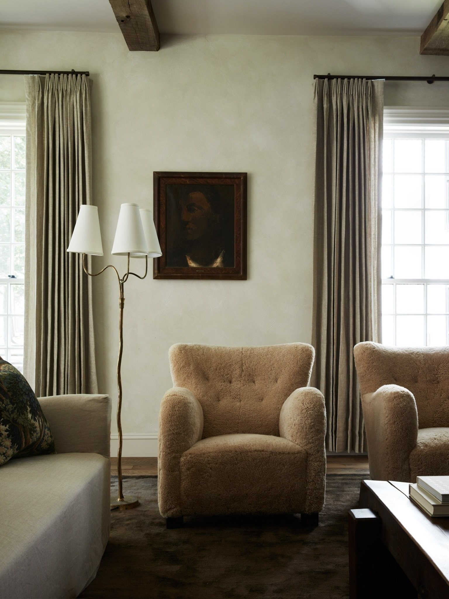
Welcome to the living space, designed by a dialogue between everyday living and intimate connection. The oversized room is surrounded by colonial grid windows adjacent to plaster walls and adorned with reclaimed beams for textural contrast. Speaking of texture, our inspiration for this room was timeless, soft drama. We first grounded the room with a moody plush rug then filled the space with a collection of custom and vintage upholstery that felt tailored yet curvy. In juxtaposition to the larger scale furniture, we let the locally sourced finishing touches: artwork and antiques speak for themselves. Throughout the home, we installed 80% vintage lighting and 60% vintage finds to support our sustainable ethos and convey a collected home full of sensible luxury.
Whiskey
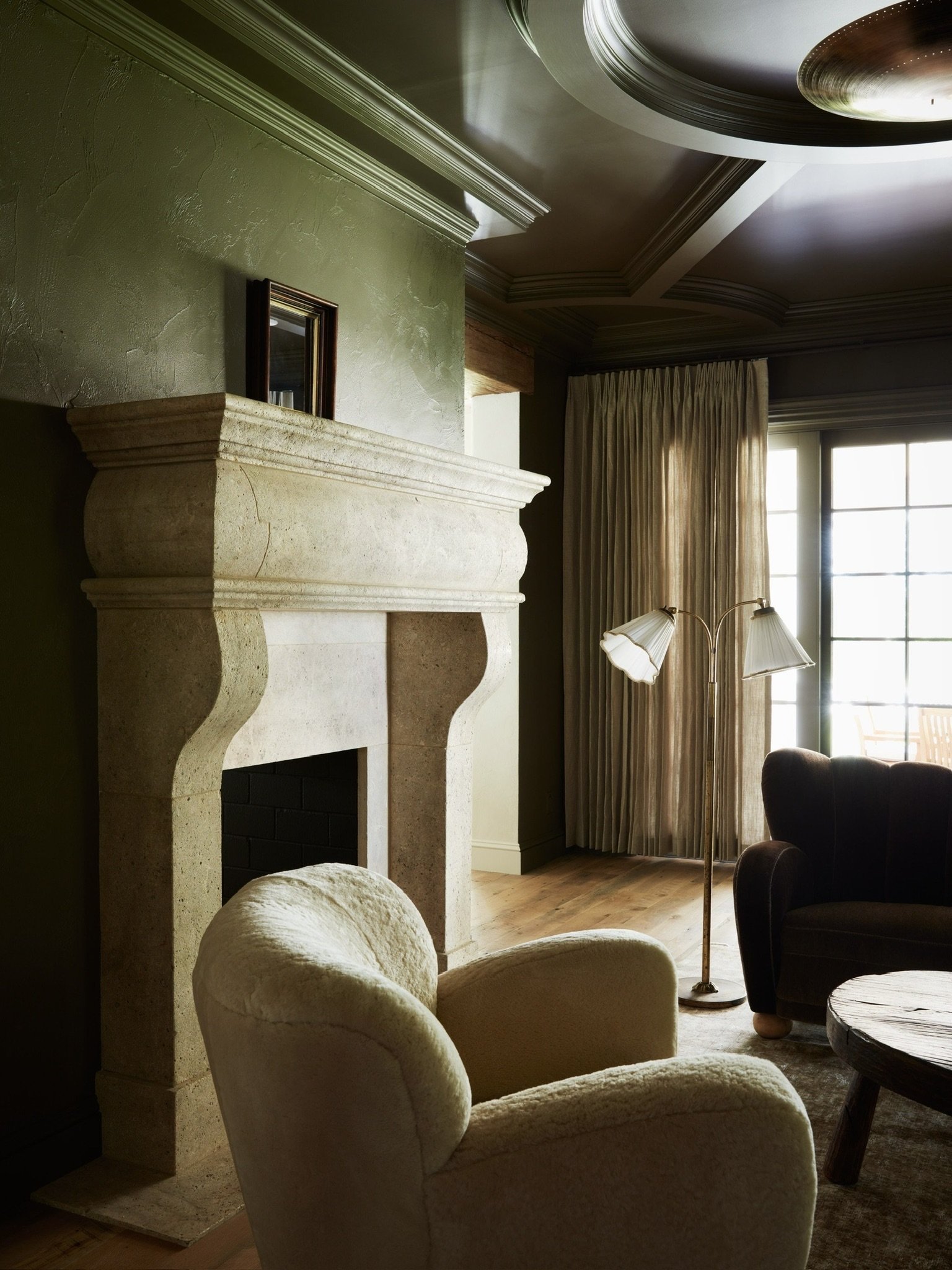
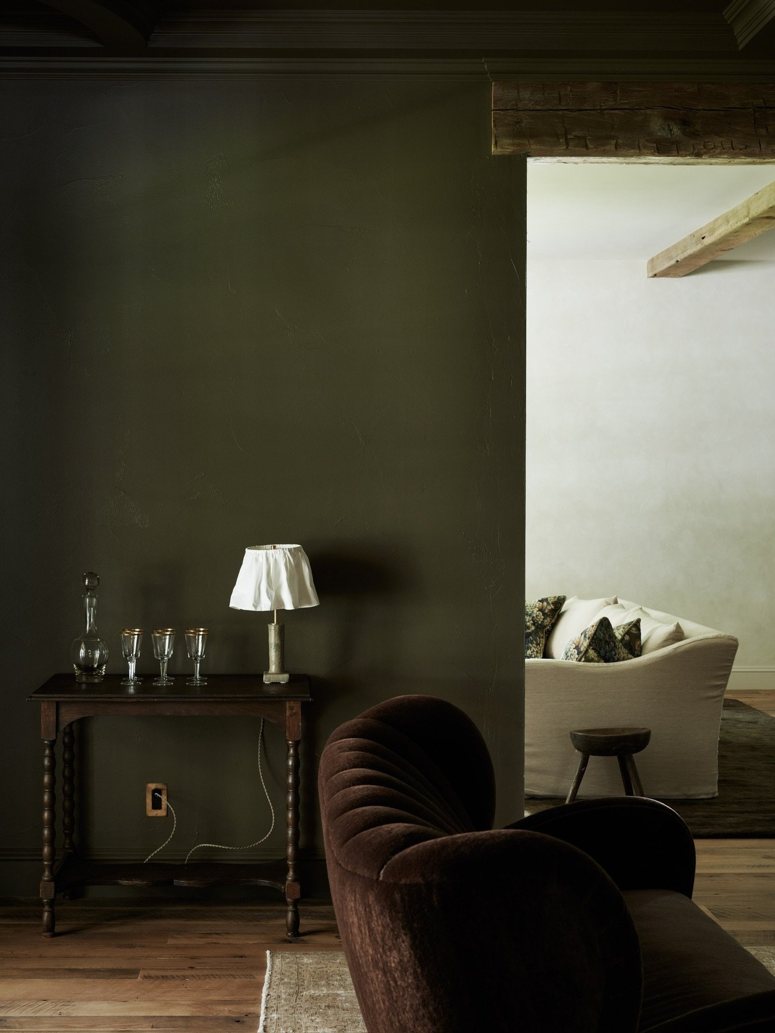
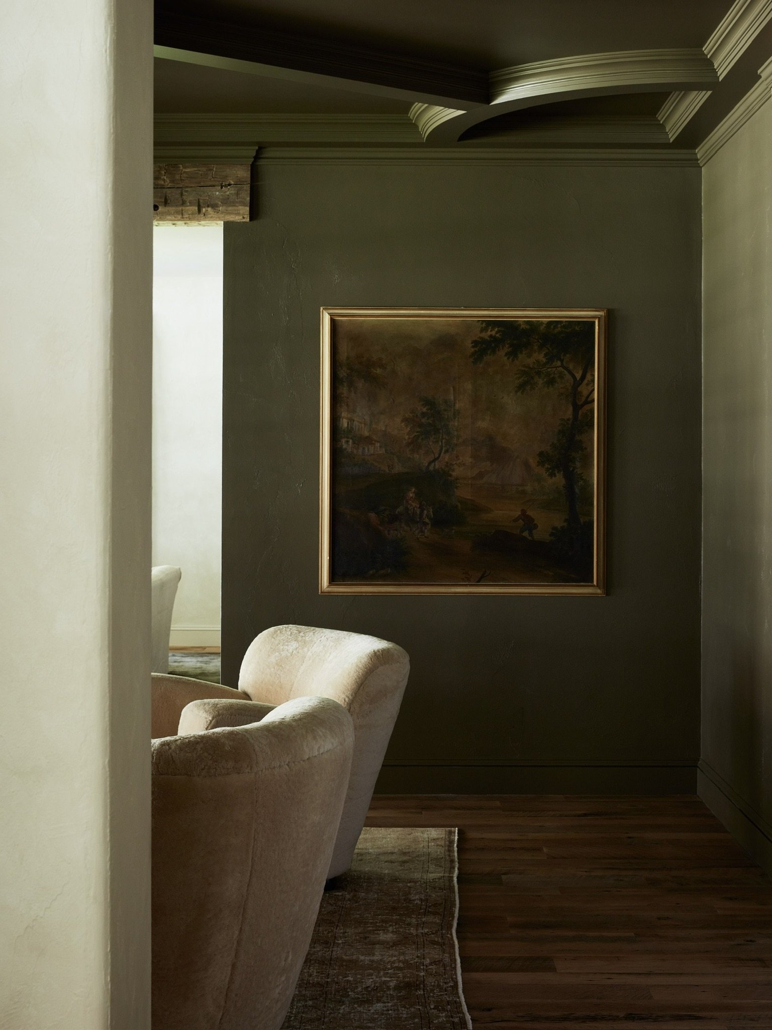
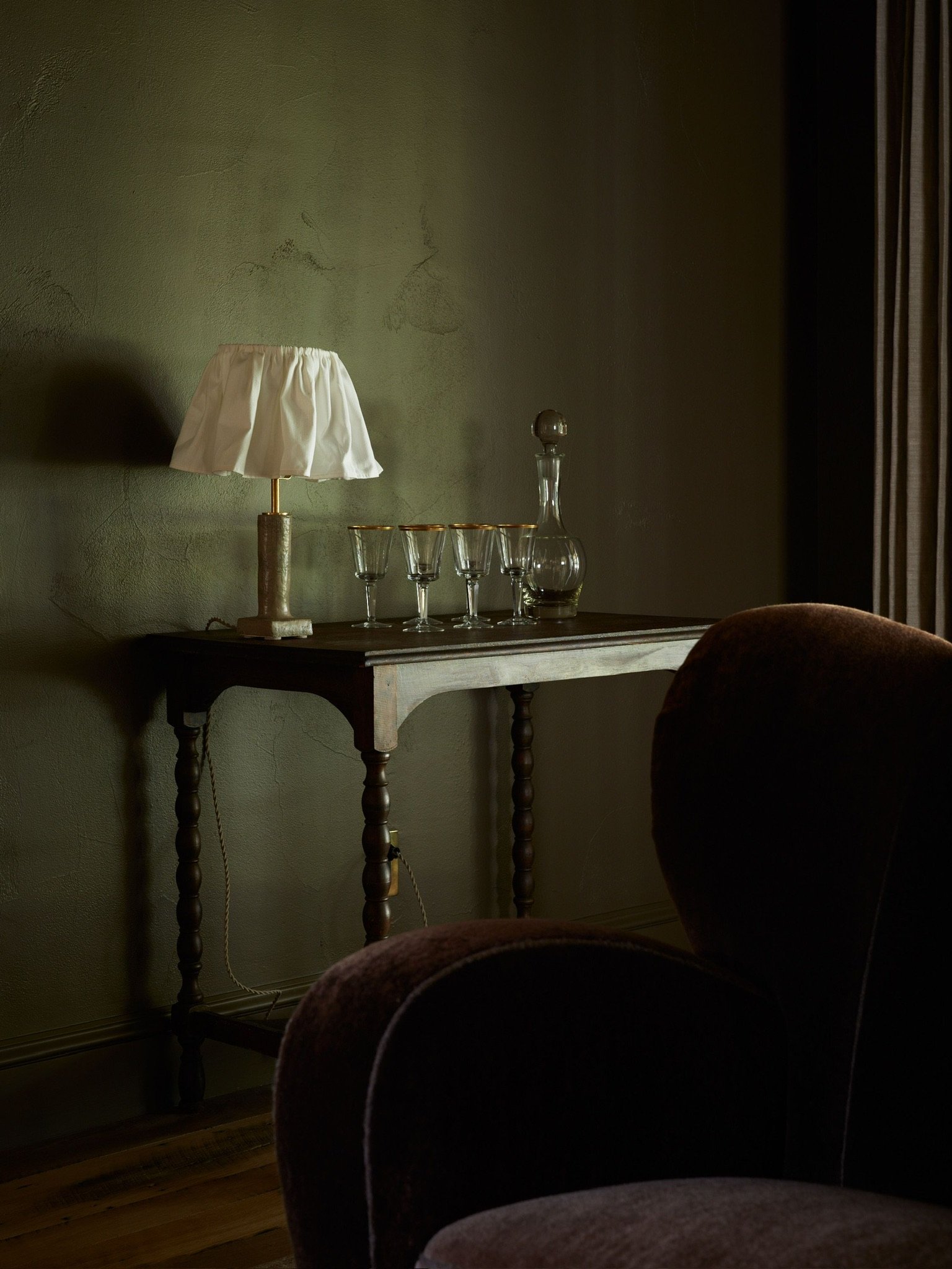
This dwelling houses a dramatic color palette that was thoughtfully curated to provide fluidity from space to space. We are always finding color inspiration from the land. There is no better way to connect house and landscape than to find inspiration from it’s surroundings and use nature/history as our North Star. The rich, moody hues we chose for this home are used in different ways from room to room and naturally enhance each space’s furniture, decor, and feeling of place. The feeling of the whiskey room has this romantic masculine energy that looks traditional but lives comfortably. Some of the best rooms are ones that can lean fancy or simple; this room can be dressed up or dressed down depending on the occasion. From rich architectural details like the antique limestone fireplace to vintage furniture and old-age accents, this elegant room is a contemporary example of classic design.
wall paint color: PANTALON farrow & ball
Kitchen
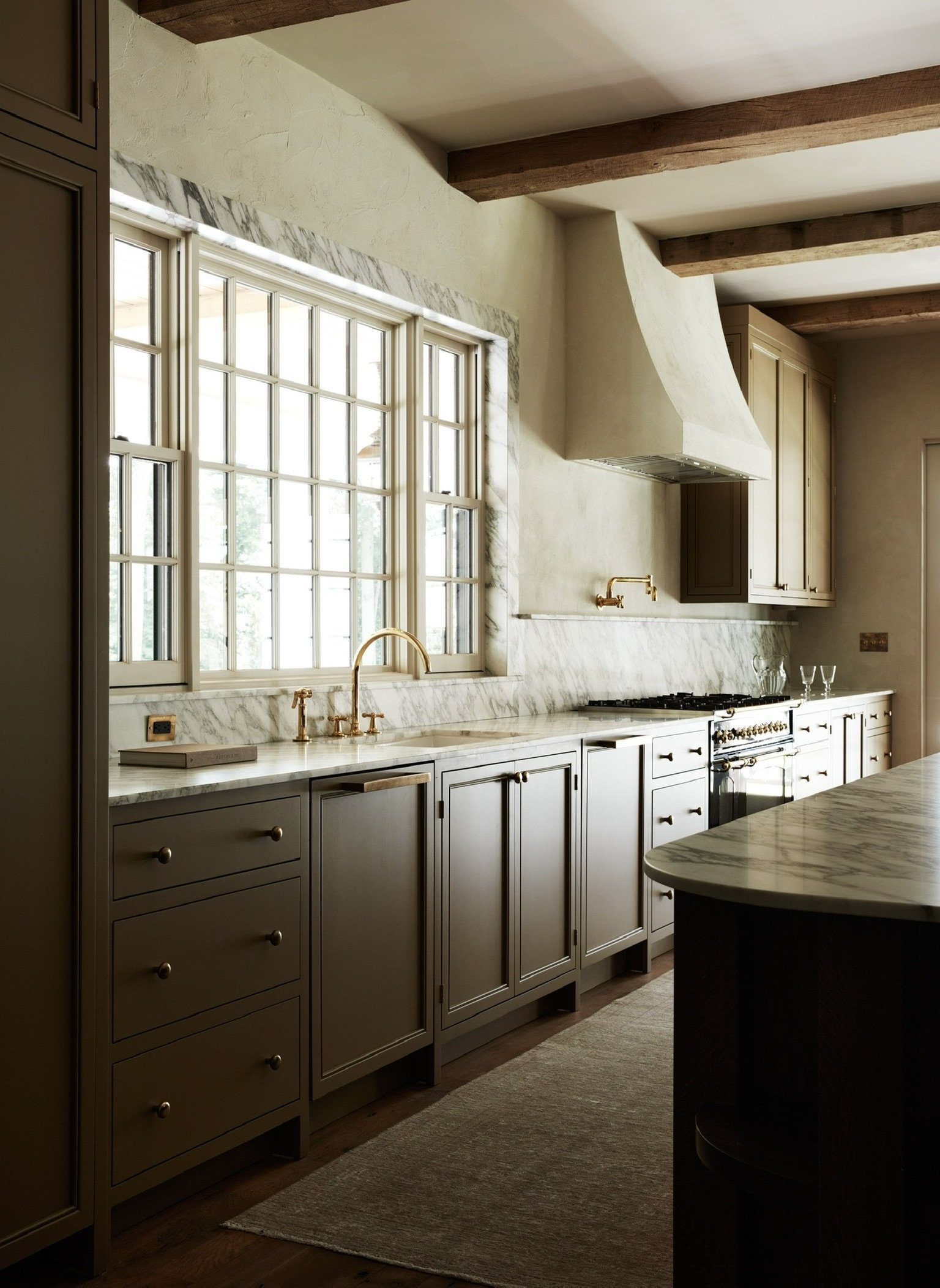
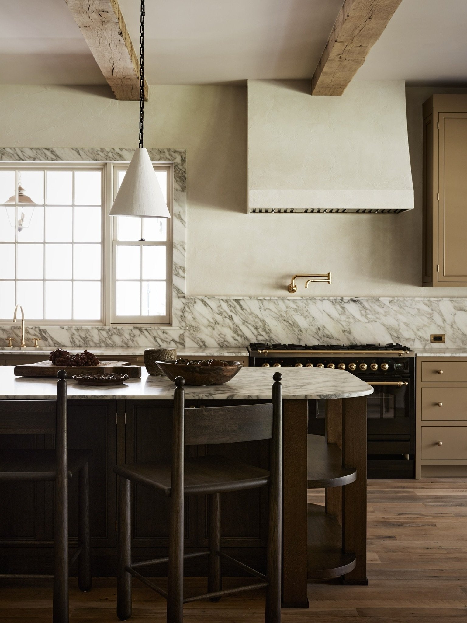
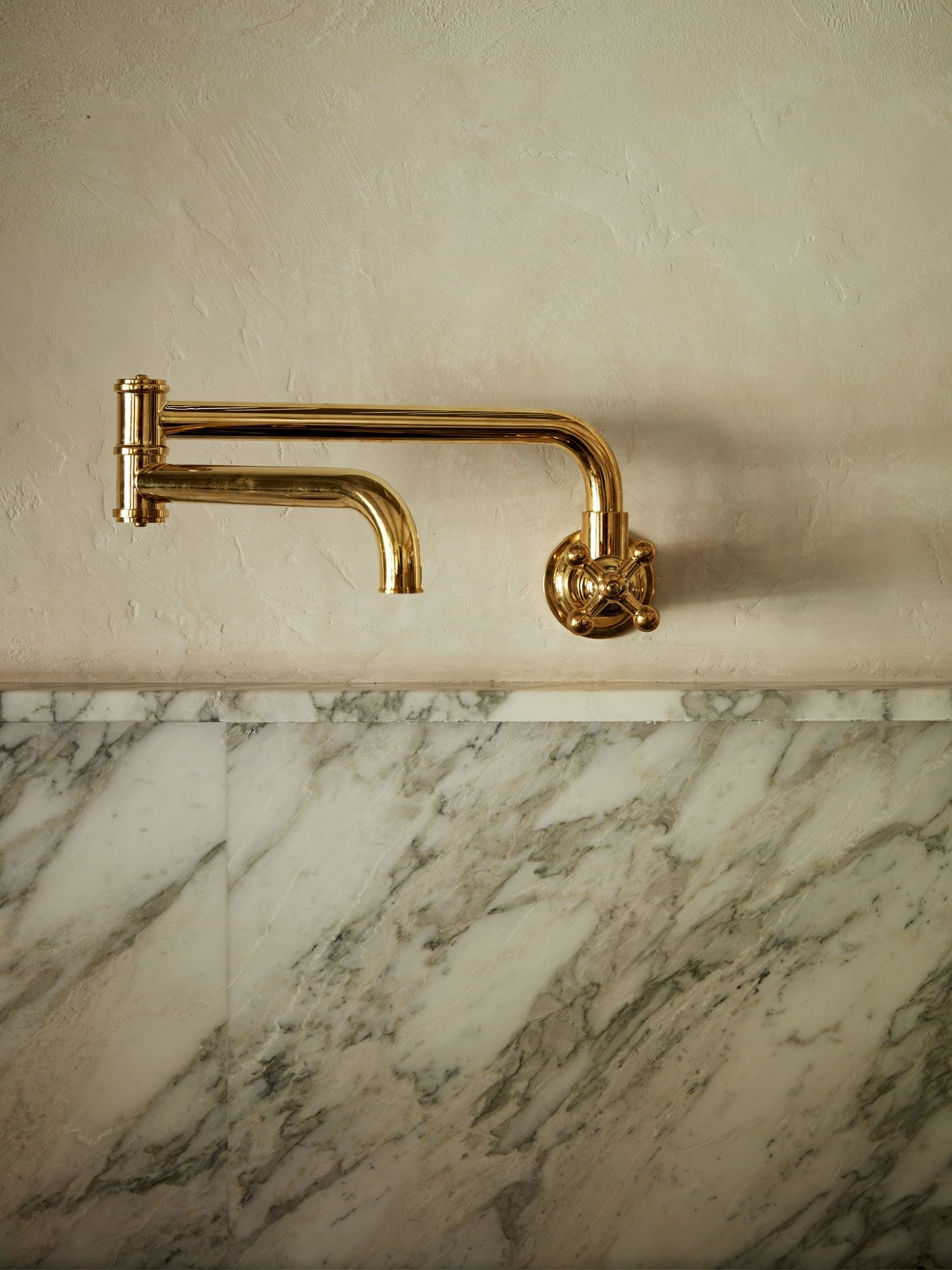
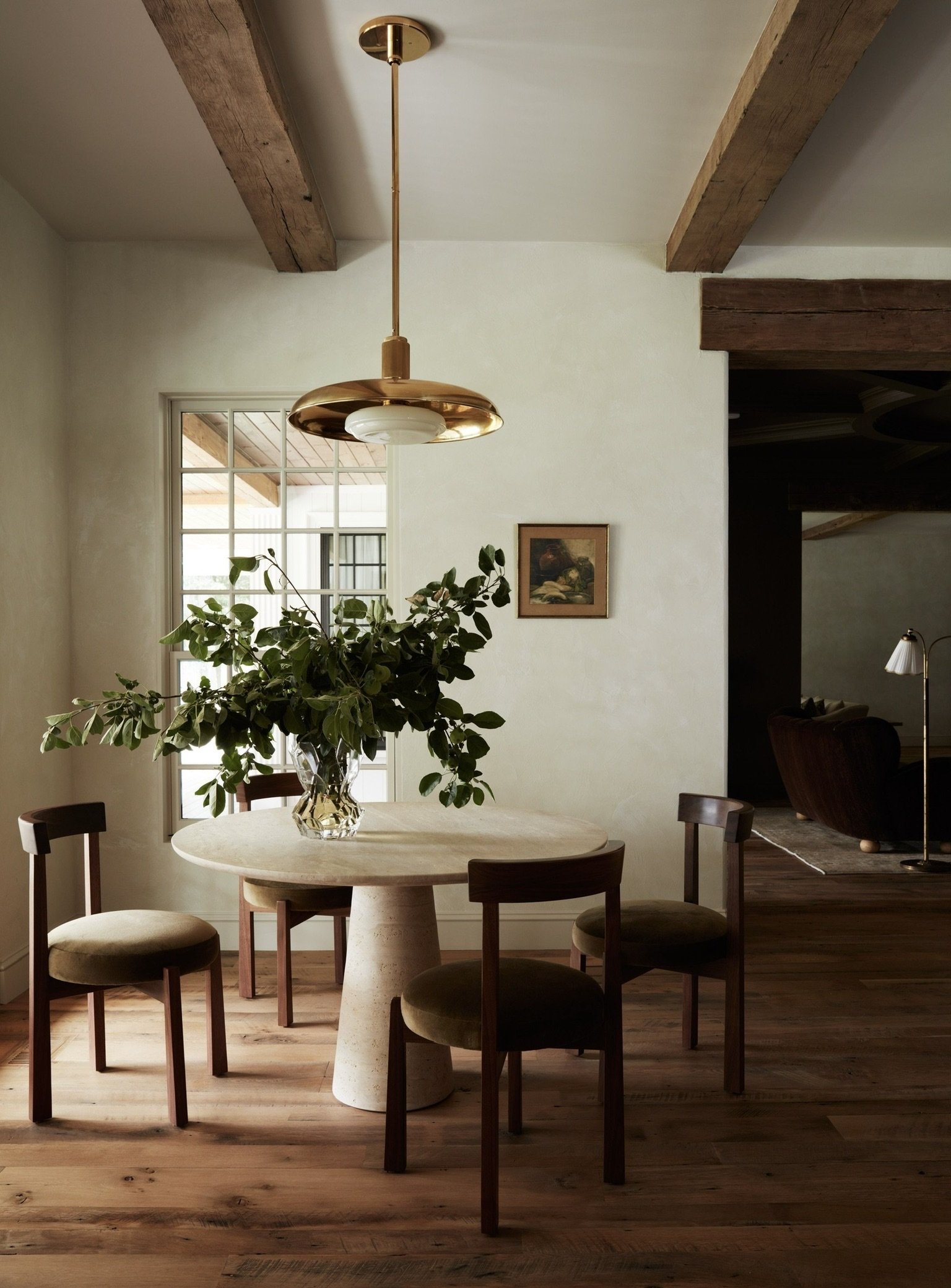
Say hello to the kitchen, heart of the home, scullery, cooker or in most cases, the *mess. This English-inspired gathering space is a breath of fresh air and effortlessly encourages an organic way of life. Painted cabinets, marble cased colonial grid windows, and antique brass finishes contributes to the welcoming environment. Another joyful collaboration was the parallel between plaster and painted elements, providing perfect contrast and harmonious balance. Did someone say chocolate? The signature L&D stain can be found in two statement-making pieces: the custom rounded island and custom counter stools. Both hand-crafted from fallen oak trees in the PNW making this a one-of-a-kind pairing. The domestic experience doesn’t end there…sitting pretty in the corner well lit under another unlaquered brass fixture is a dining nook intended for cherished memories of heirloom recipes and intimate dialogue.
CABINET paint color: DRAB farrow & ball
Dining
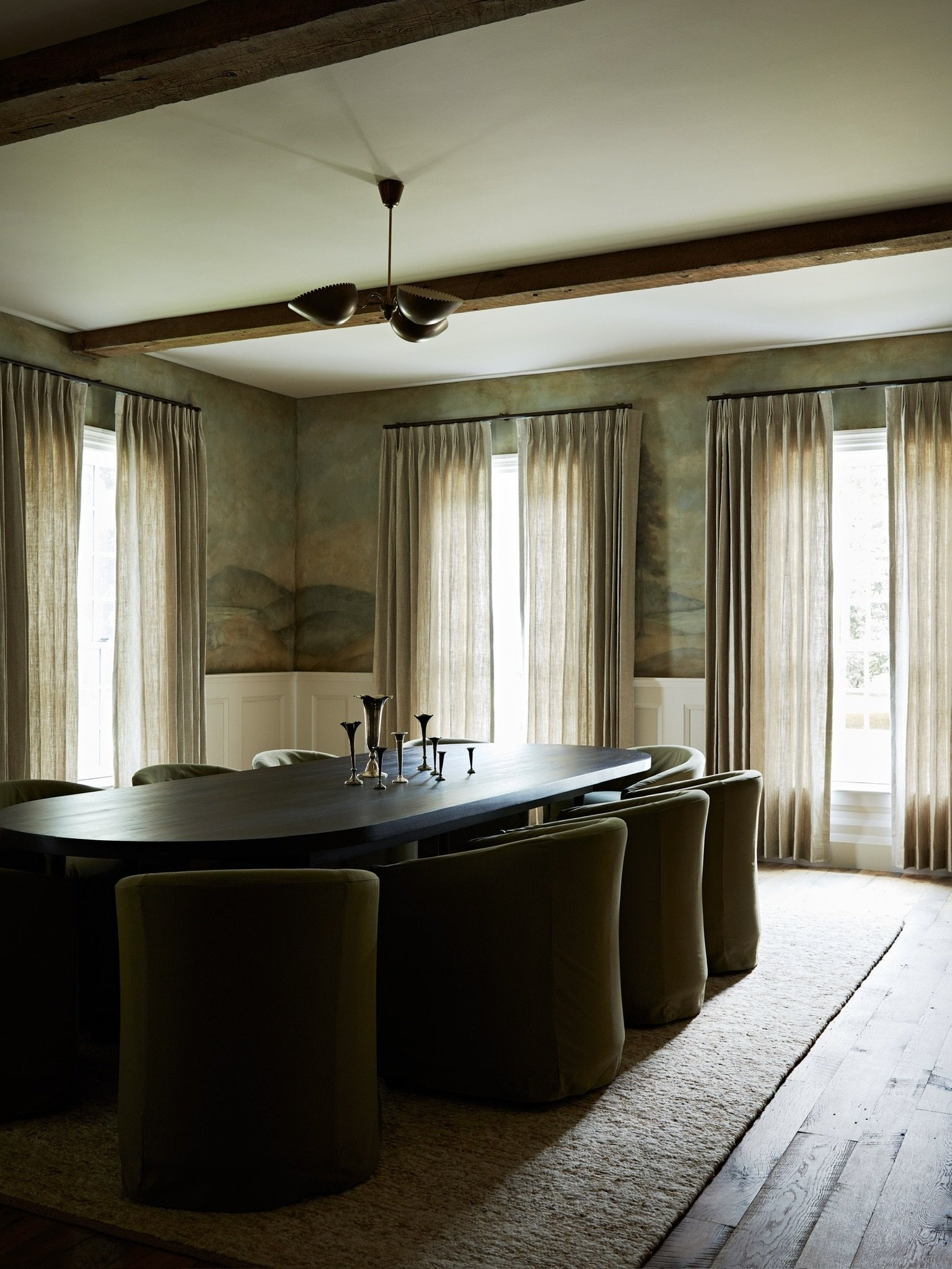
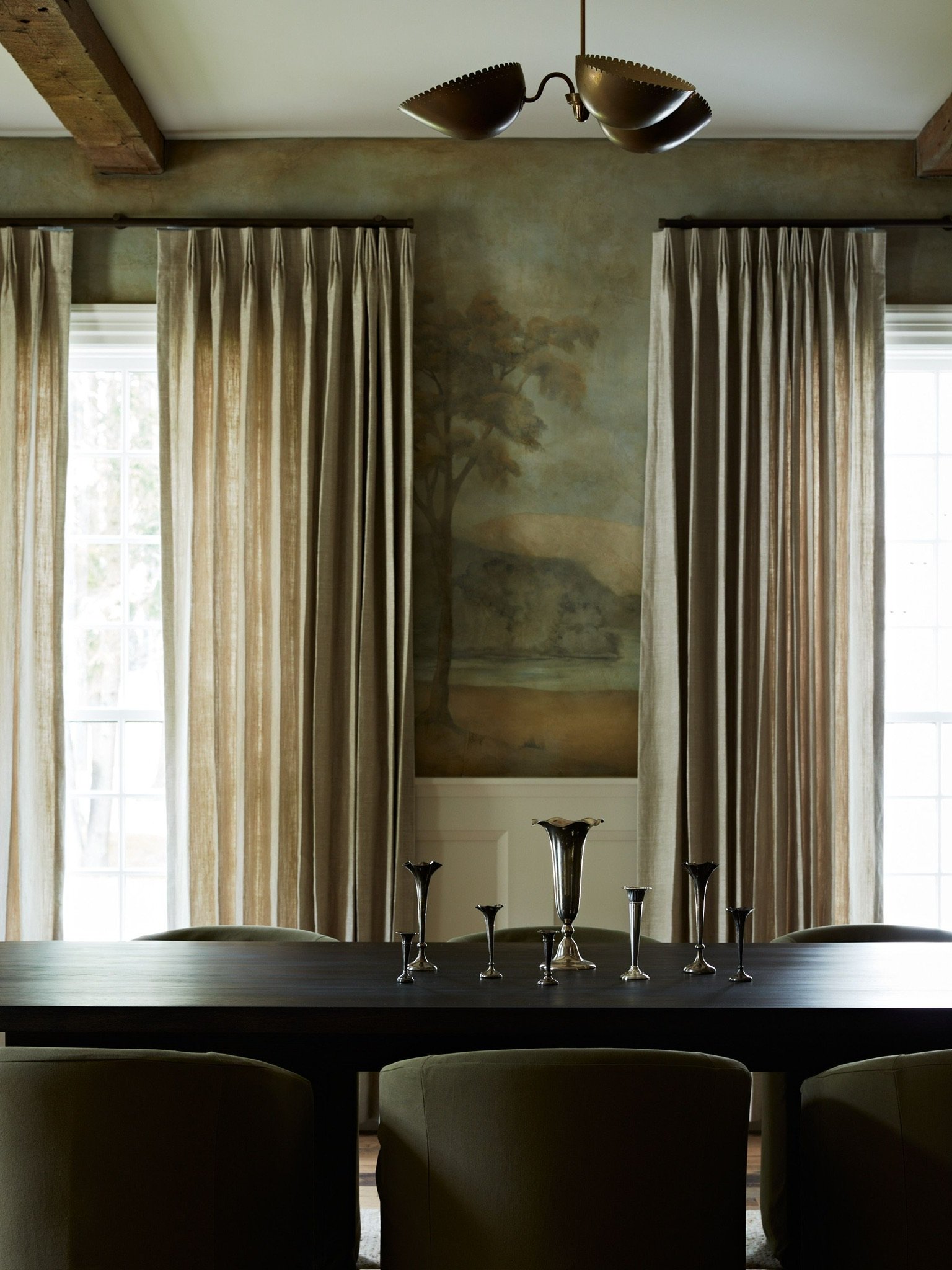
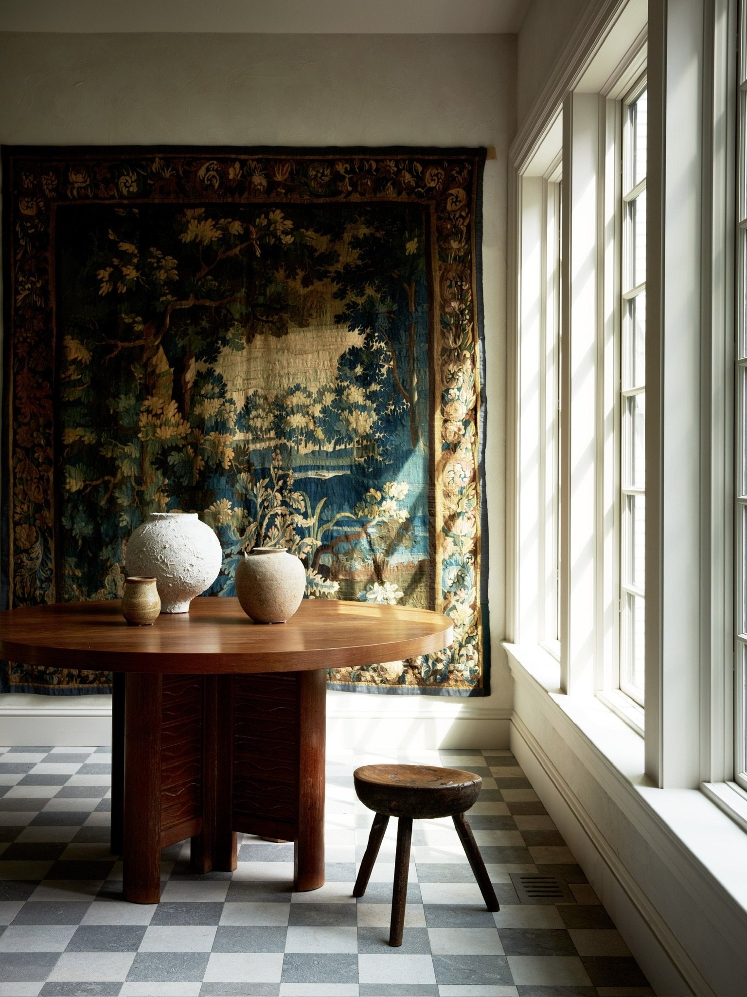
Bon appétit! The dining room of this project is surrounded by a strong visual accent: a mural of an earthen scene in Europe. The entirety of the painted tapestry needed softening, so floor to ceiling drapery proved to be the perfect balance. Imagine these curtains billowing the summer breeze or changing shade by the seasons…The centerpiece of the room is a custom chocolate dining table, intentionally oversized to comfortably host 10-12 guests at any given time. The vintage brass chandelier and green club dining chairs animate the mural and gives light and warmth into the space.
Primary Bed
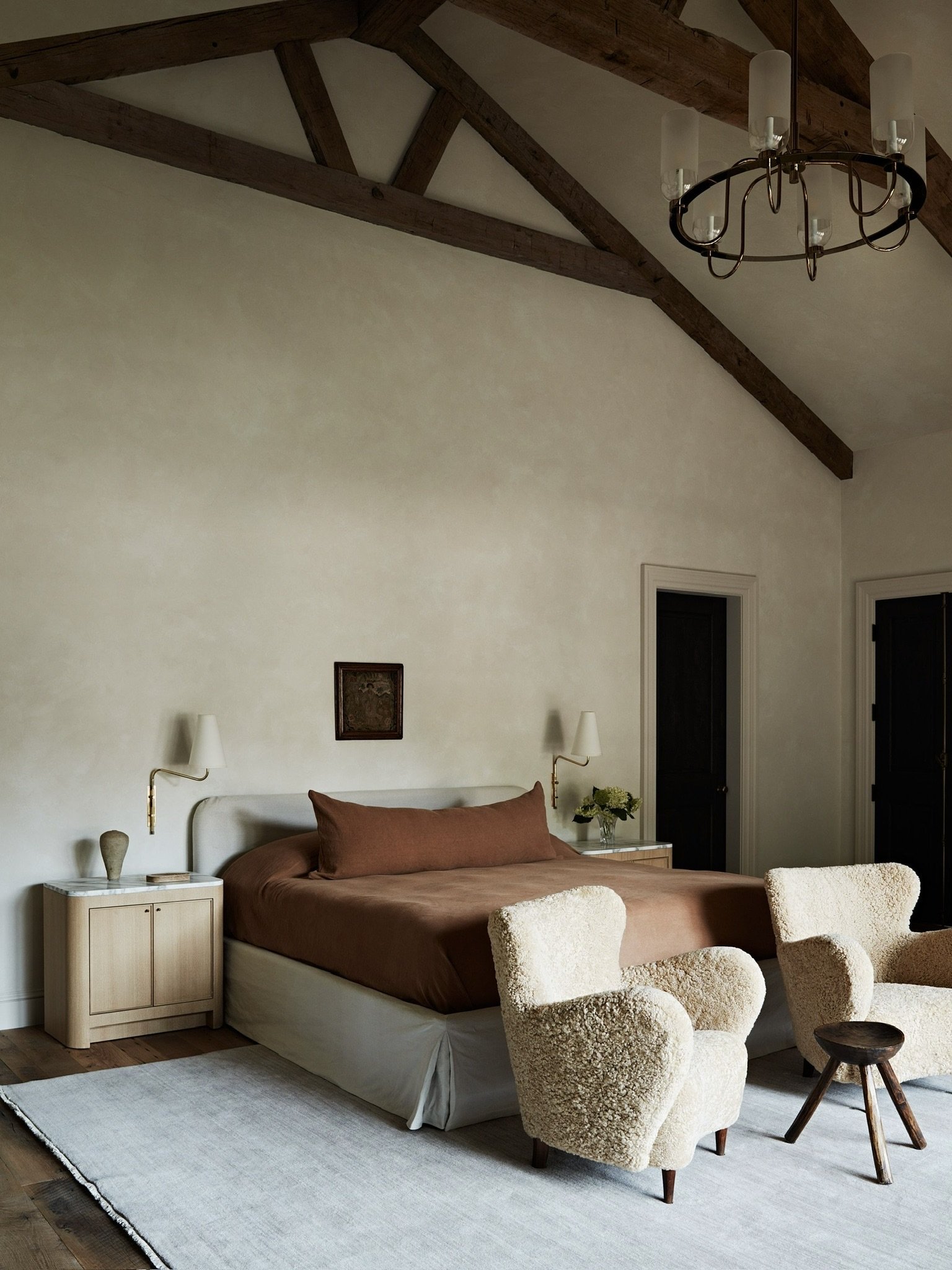
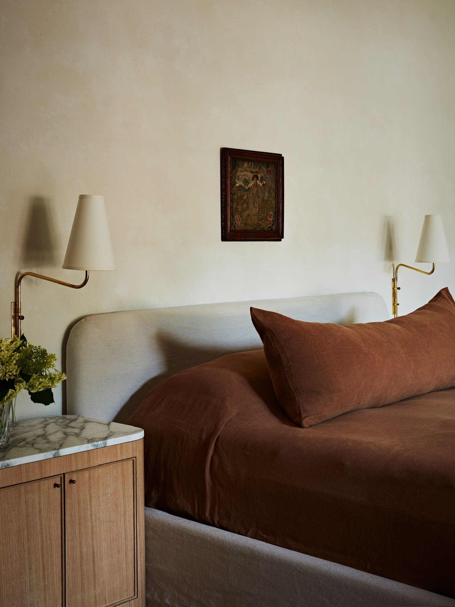
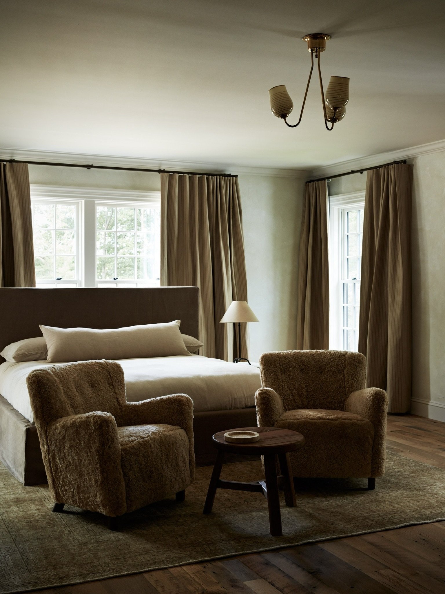
We took well-being to new heights in the primary bedroom. Through colors (terracotta, oatmeal, pecan, etc.) and materials (plaster, oak, brass, linen, shearling, etc.), we created an idyllic setting for ultimate relaxation, wellness, and warmth. The 20’ ceilings set the tone of the grandeur space and are grounded with minimal, chic accents. We wanted this space to feel intimately connected to the comfort of the owners and to select elements that offer elevated ease and unmatched quality.
Guest Beds
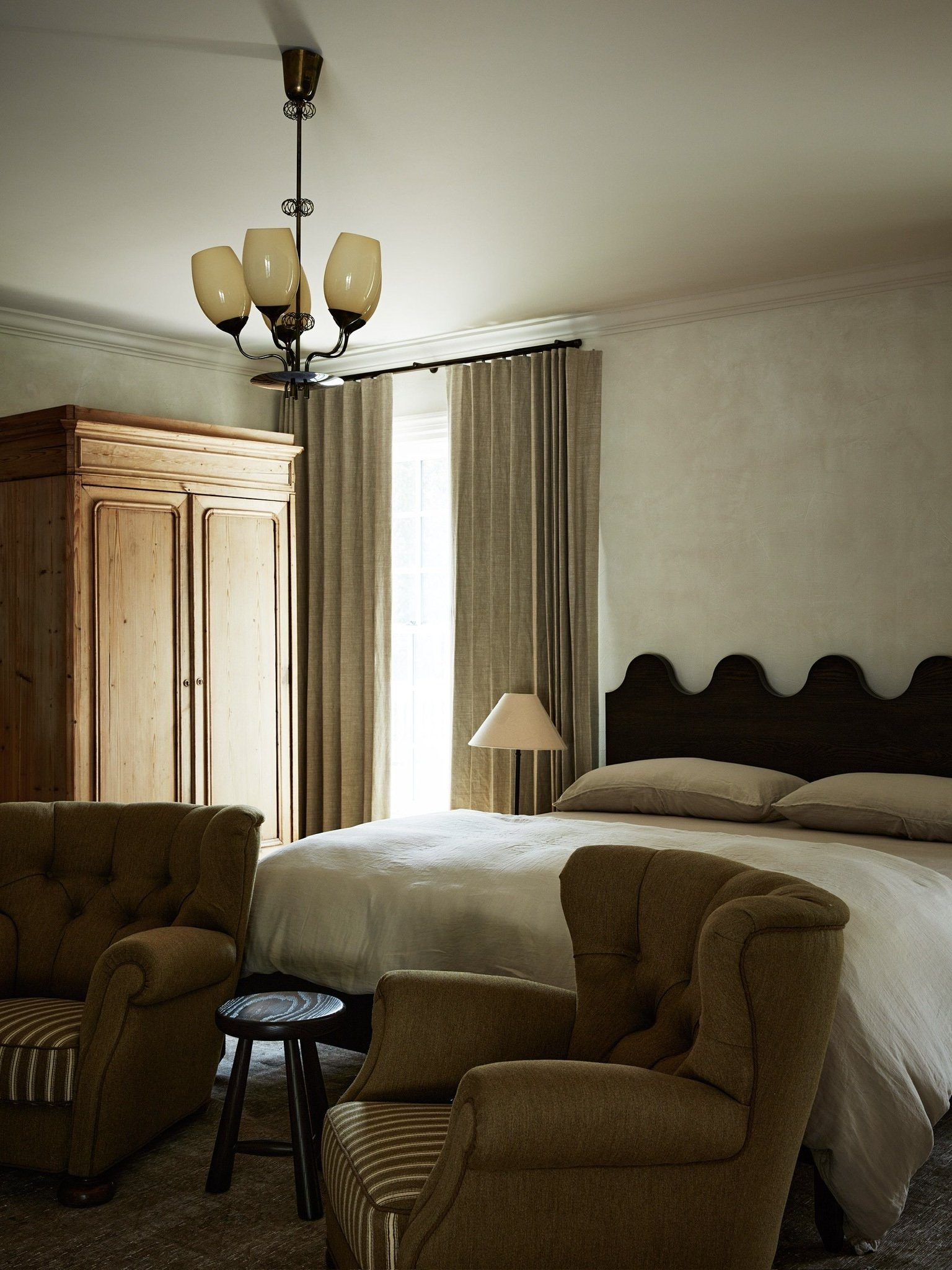
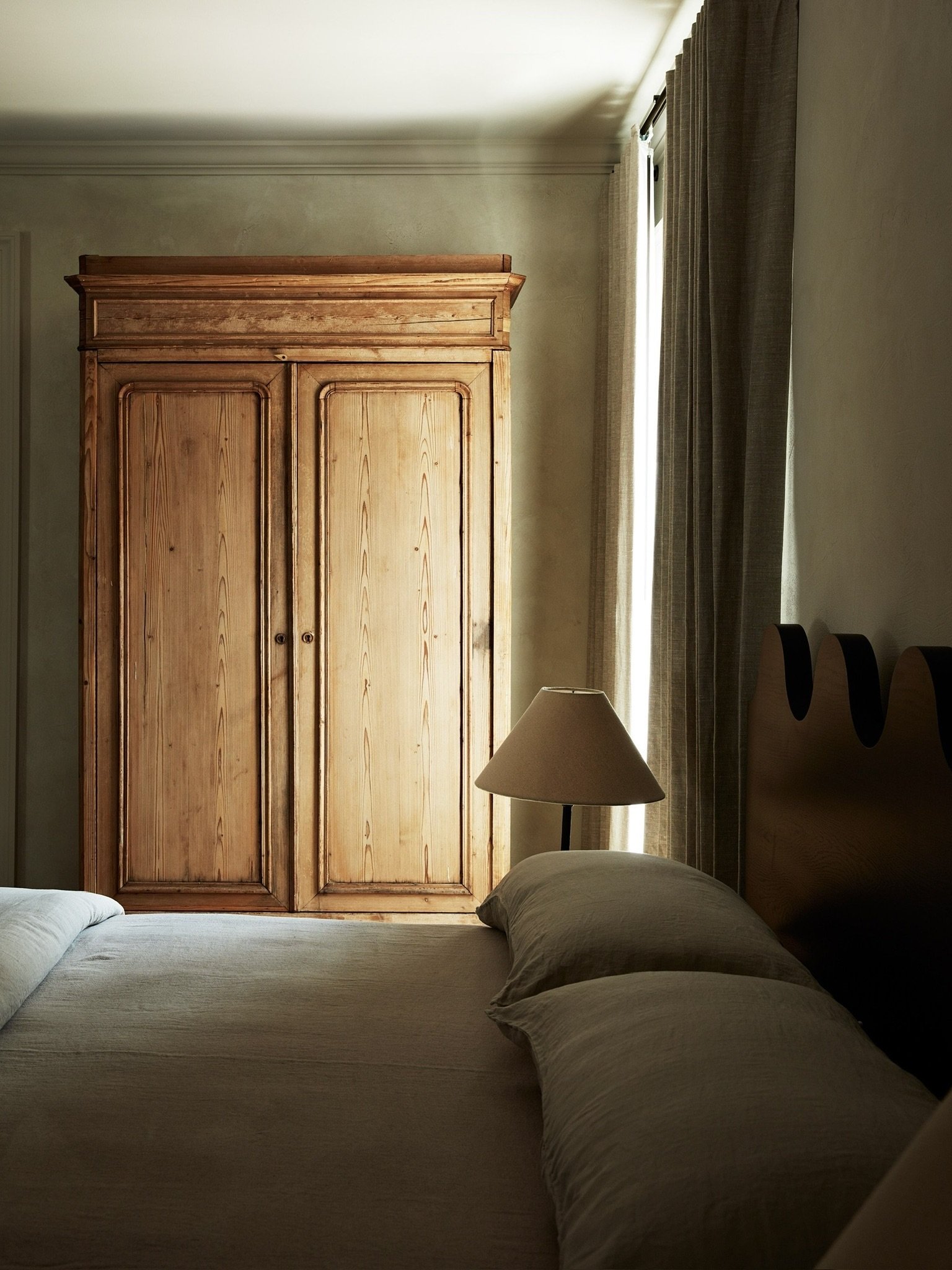
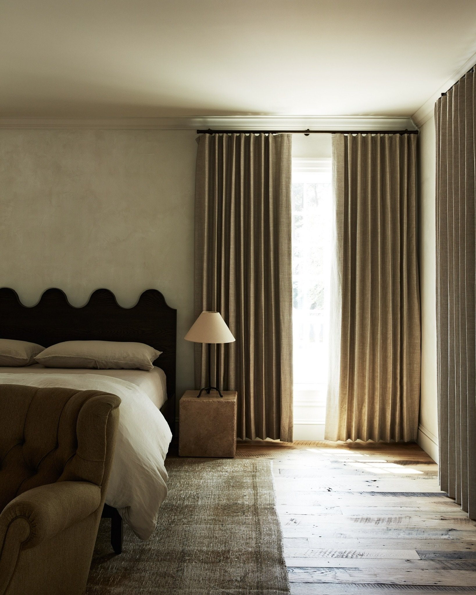
The guest bedrooms are designed as small suites and serve as a place for either coffee for early risers or drapery to block the abundant light for those resting snoozers. Each room optimizes the space’s floor-plan and adds value to the home’s cohesion. Our penchant for vintage European lighting is showcased in every bedroom, many fixtures dating back to the early 1900’s! Featured below is our custom L&D wave bed seen in the signature chocolate stain. We always love the weight and statement of a primitive wardrobe in the bedroom.
Spaces In-Between
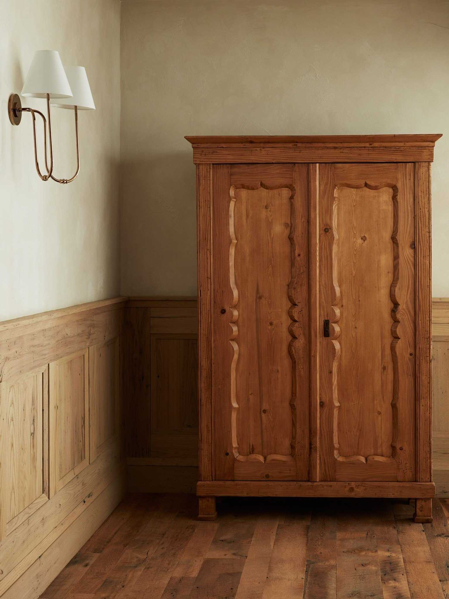
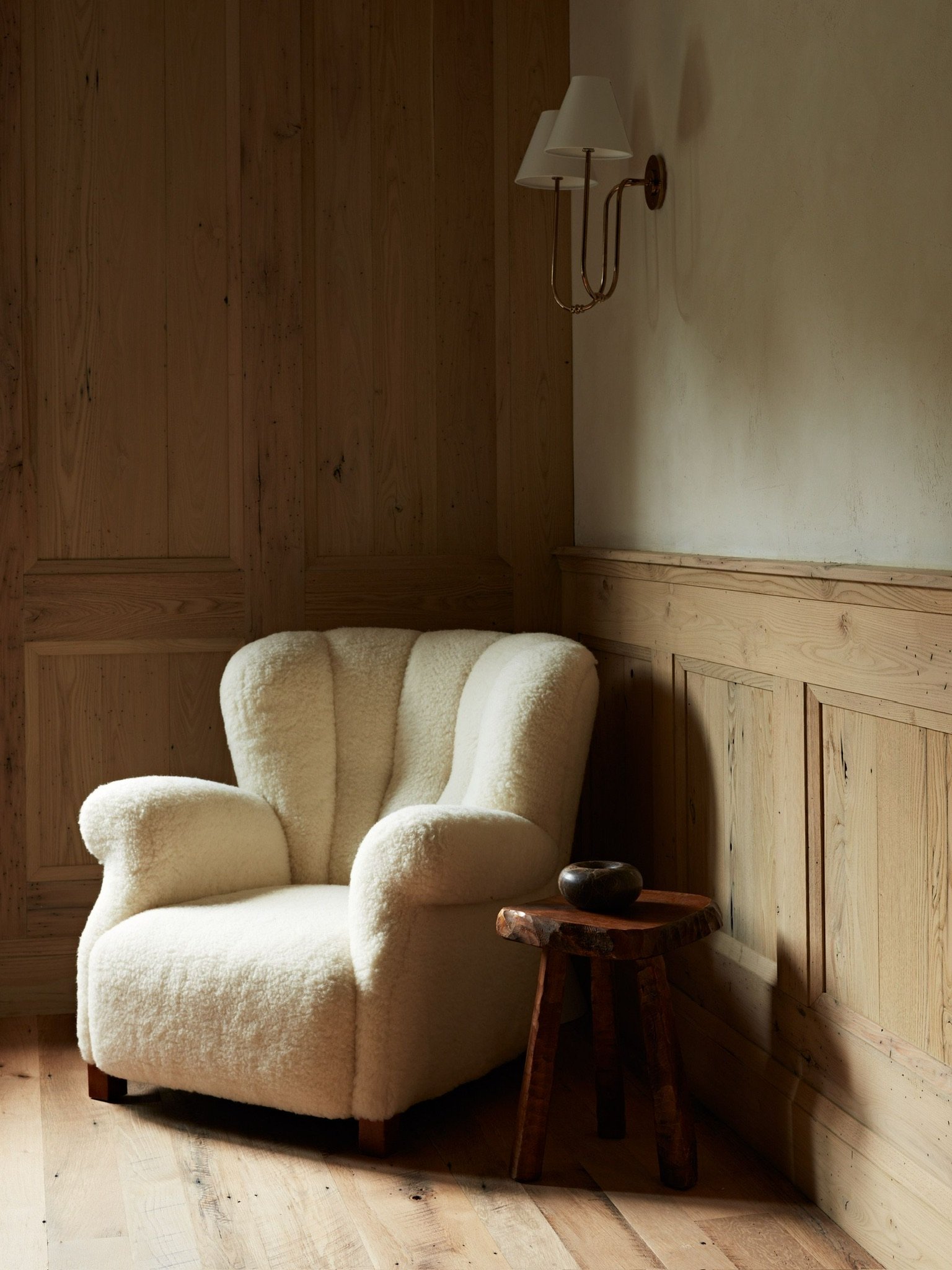
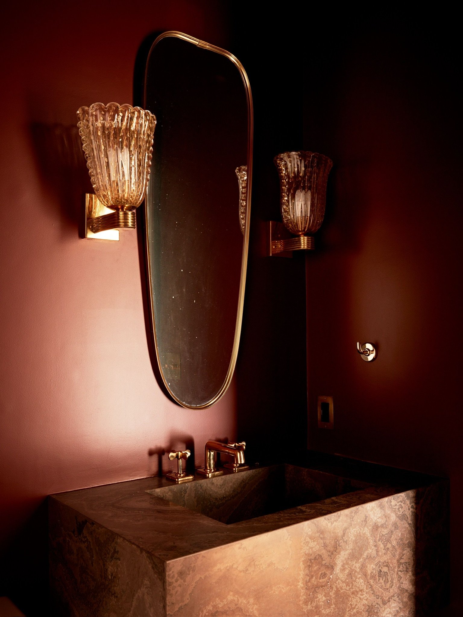
Each home has spaces in between, the small pass-throughs that sometimes act as the soul of the house. To add some country flavor, we created a tonal corner with a primitive armoire that can serve as a linen closet or gear storage. The natural light filled passageway evokes chic playfulness and celebrates the way we use design styles to create personal connection. Another vignette sits against the wood wainscoting as a moment in between spaces…what a serene reading nook! Last but not least, we introduce the bold powder room that contains a dramatic stone sink, elongated mirror, and vintage Bollicine glass sconces we purveyed from Italy. As we say here at Light and Dwell…it is all in the details. We hope you loved every detail of our beloved English Colonial Project.
See the full portfolio page here. Please share the love and comment your favorite elements about this beautiful dwelling, we can’t wait to hear your thoughts.


